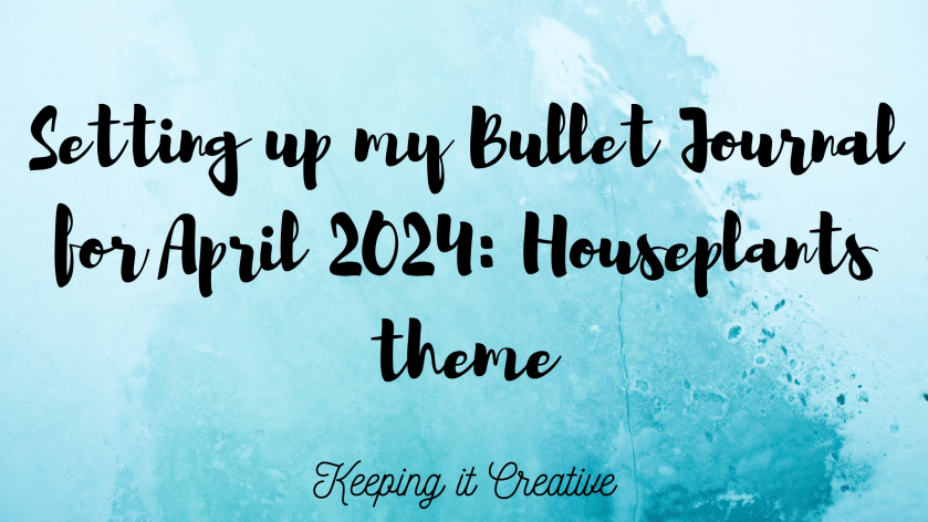
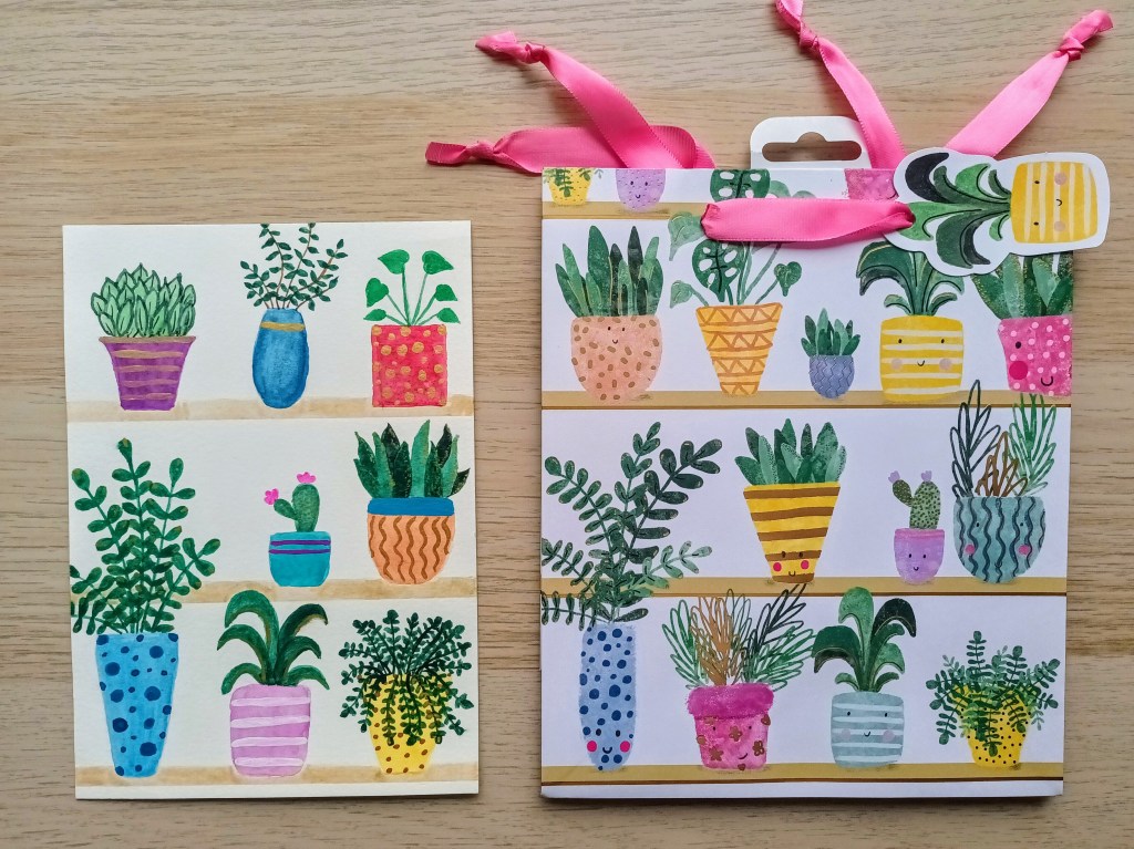
For this month’s BuJo theme, I took inspiration from a cute little gift bag I found in one of my local garden centres. I made stickers to decorate most of my spreads but wanted to do some watercolouring for the front cover. Unfortunately, I’ve been ill with a bad chest infection so, although most of my pages have been set up since the beginning of the month, I was only well enough to work on my painting for the last few days. I was really pleased with the finished design and wanted the gold effects to be seen in my bullet journal so I’ve actually trimmed the watercolour paper and stuck it in. Usually, I wouldn’t do this, but as I’m nearly at the end of my notebook, I’m not so bothered with the bulk it has added.
Photo credit: Laura Jones for Keeping It Creative
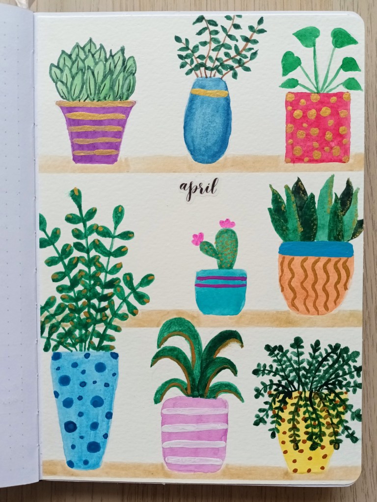
The front cover
My finished cover image had to be trimmed down slightly to make it fit in my bullet journal which was a shame but I hadn’t intended to glue it in so I didn’t check the paper size. When I scan my paintings in, it’s easy enough to shrink them to fit so I always use an A5 watercolour piece of paper.
I had great fun mixing the colours for the pots and leaves and I loved using my Finetec palette to add some gold detailing. The shimmering effect is so pretty and I’m excited to open my BuJo each morning to check my schedule for the day. To get the shelves looking super sharp and straight, I applied washi tape to the bottom of each and then used a light sand Tombow marker to colour in. You can probably see that it’s not watercolour but I really don’t mind! The April title is a little sticker I made using a font I found on Canva.
Photo credit: Laura Jones for Keeping It Creative
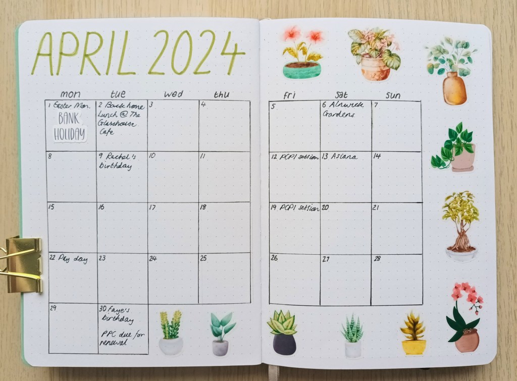
Monthly Calendar pages
Last month, I had another free trial of Canva Pro so I typed in ‘watercolour houseplants’ and chose my favourite images to use as stickers. Cricut have finally fixed the issue with their print and cut sticker offset in Design Space so I was able to print my sticker sheets straightaway without having to reboot my computer. I’m so pleased they eventually sorted the problem as it saves so much time.
Photo credit: Laura Jones for Keeping It Creative
Expenses
I decided to use a mid green Tombow brush pen to highlight every other line in my expenses chart this month. It takes a while to do them, as I use washi tape strips to get the bottom of the lines perfectly straight, but I think it adds more interest to the spread. I left enough room to add three pot plants as decor too.
Photo credit: Laura Jones for Keeping It Creative
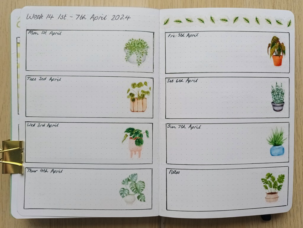
Weekly plans
April is another busy month so I wanted plenty of space to record daily events and to do lists but also a little room to add some plant stickers. I decided not to do a Dutch door layout this time but stuck with the horizontal days. I’ve added my running task lists to the pages after my weeklies like I did in March. The leaves across the top were created using a single leaf shape spaced out and in different orientations to make a kind of border to fill the space. I created one for each week and I think it finishes the pages nicely.
Photo credit: Laura Jones for Keeping It Creative
Final words…
Thank you for taking the time to look at my bullet journal pages for this month – I hope you like my chosen theme and my designs. I apologise for sharing them so late but I’ve been feeling completely wiped out for several weeks. I’m still not totally better but I managed to go to Clubbercise yesterday and Zumba today, so my energy levels have certainly improved.
I hope you’re all having a lovely April and that the weather where you are is better than it is here in Sunderland – we’ve had so much rain recently and one of the flower beds in our back garden is completely flooded and has been that way for weeks.
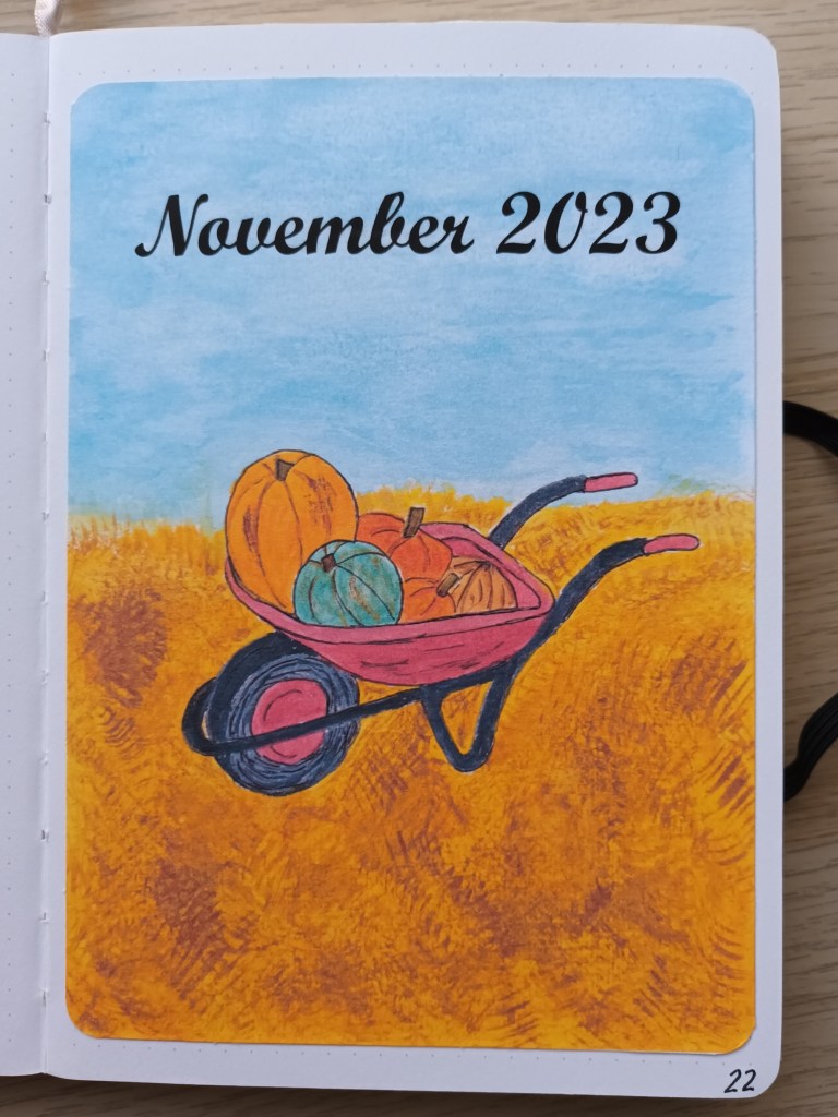
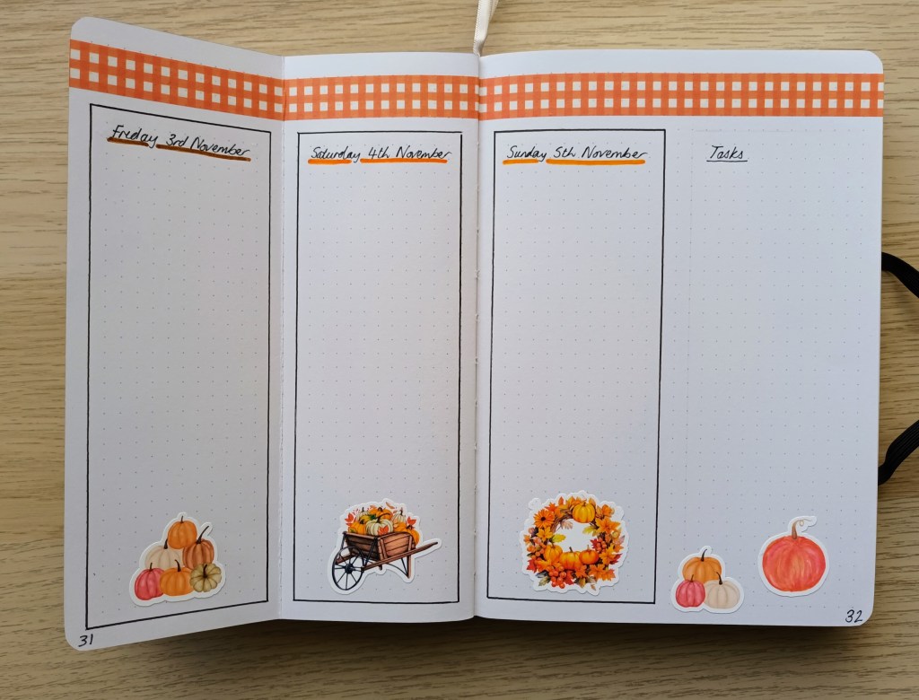
This month, I’ve gone with a pumpkins and squashes theme which includes stickers I made using my Cricut Joy and my own watercolour painting. I got most of the layouts done about a week ago but spent a good while yesterday playing with my paints and then creating my front cover. I hope you like my art work as I’m really pleased with how it turned out.
Front Cover
The idea for the theme and cover this month comes from my experience of going to a pumpkin patch a few weeks ago. The wheelbarrow is based on the actual one we used to put our squashes in but I used artistic license to create a the different varieties of pumpkin as we only picked out three small ones to take home.
Before painting I sketched out the wheelbarrow and placement of the squashes with light pencil. I also practised doing the straw and mud on the ground by creating a darkish yellow wash and then using a dry fan brush to create a messy effect. I think it works nicely and I hope you can tell what I was trying to achieve. The sky was created with a pale blue turquoise wash and I used scrunched up paper towel to lift the paint to create a loose cloud effect.
The original artwork – the paper has curled so I need to put it under a heavy book!
Rather than glue the thick, watercolour paper in, which would add too much bulk, I’ve scanned it in on 110gsm paper and stuck in it. The colours aren’t exactly the same, but I’m happy with it.
Photo credit: Laura Jones for Keeping It Creative
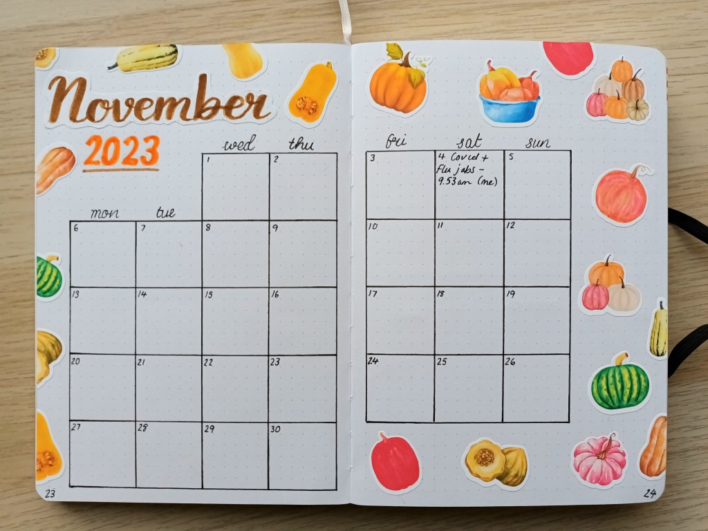
Calendar page
The calendar is made of my usual 6 x 6 boxes using a 0.3 Pigma Micron. The November title was created using a brown Tombow brush pen and I added the year for reference so I can quickly see when it was produced (I’m getting quite a collection of old BuJos now!) The squash designs were from Canva Pro and I made the stickers using my Cricut Joy. The offset isn’t perfect as usual but I think they look okay.
Photo credit: Laura Jones for Keeping It Creative
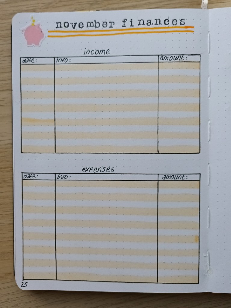
Finances page
This month, I’ve only created one page instead of the usual double page layout. This is because I’m taking part in No Spend November and so my only personal expenses should be for essentials rather than luxury items. The page to the right of it will be for a spot of journalling about how we get on with our challenge.
Photo credit: Laura Jones for Keeping It Creative
First weekly plan
I’m trying a different layout this week to see how I get on with having more room to write each day. As part of the set up, the second page is folded in half and this is so that I can see my task list all week and can transfer items from it to my daily plan as and when I decided which day I want to complete or start a particular task. I’ve taken a couple of photographs to show how it works.
Photo credit: Laura Jones for Keeping It Creative
Photo credit: Laura Jones for Keeping It Creative
The washi tape is part of an autumnal set I picked up at The Range. It’s not wonderful quality but there are some nice designs and colours.
Final words…
Thank you for taking the time to check out my bullet journal spreads for November. I hope you like them all. It’s been a while since I did some watercolour painting and I thoroughly enjoyed it. Using watercolours is a wonderful mindful activity and, for me, it was a great way to spend a few hours over the weekend whilst the weather was completely miserable. You don’t even need to paint an actual picture, just messing about with the paint and different techniques is enough to calm the mind.
Hi everyone, I hope you’re all doing okay. For this month in my bullet journal, I took inspiration from our garden and decided to do a floral theme – I know it’s a popular / common theme but hopefully my take on it is a little bit different. There are so many stunningly delicate flowers popping out right now and quite a few of them in one of our beds have been a complete surprise because they’ve self seeded from next door’s hanging baskets that they had up last year (no idea how this has happened as their baskets are on the other side of a six foot fence). The result is some wonderfully thick clumps of viola and pansies in an array of gorgeous Spring colours. Not a bad display for a cost of £0.00! I hope you enjoy looking at my spreads for May and I wonder if they might prompt you to do a little watercolouring in your bullet journal sometime soon?
The front cover
Photo credit: Laura Jones for Keeping It Creative
To enable me to include lots of different flowers and leaves, I decided to try out a watercolour wreath for my cover page. I used my Helix circle drawing tool to create the basic shape and then lightly sketched out the flowers and leaves. Most are based on real florals including cherry blossom (which is overhanging our garden from next doors tree), forget-me-not (which we often see on woodland walks) and the little patches of bedding plants, but I did use a little artistic license in places when it came to the leave shapes and colours. When I was happy with the basic design, I used a 003 Pigma Micron to ink them in. The ink is waterproof so it works great with watercolour.
I had great fun mixing different shades of watercolour and was glad of my three plastic mixing palettes. I used a size 0 brush for most of the larger areas and a teeny tiny 3/0 brush for the little berries and the thin stems. After everything was dry, I added some little dots of gold here and there to give the piece a bit of shimmer – it probably doesn’t show up well on the camera but IRL, it looks good! In the past, I’ve used watercolour paper to create a design to paint and then photocopied the finished piece but the colours are never the same on the printed image so I’m pleased I painted straight into my bullet journal.
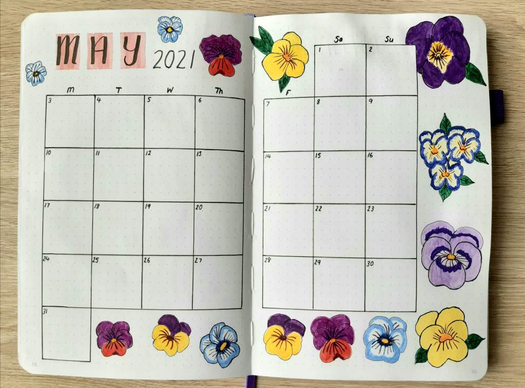
The Monthly Calendar
Photo credit: Laura Jones for Keeping It Creative
This is my usual calendar set up – it’s just the right size for noting appointments and events so I never see the need to change it. There are lots of different cute colour combos in the little violas and pansies so I decided to have a go a painting some of them. I spent hours doing the different florals, mixing the paint to get shades just like the real flowers and adding the little lines from the centre. There was lots of precision involved but I’m really pleased with how they turned out. The 160gsm paper means that the paint doesn’t bleed through but it’s not as smooth to work on as watercolour paper. My next BuJo has the same thickness of paper so I’ll definitely be doing some more painting in the future.
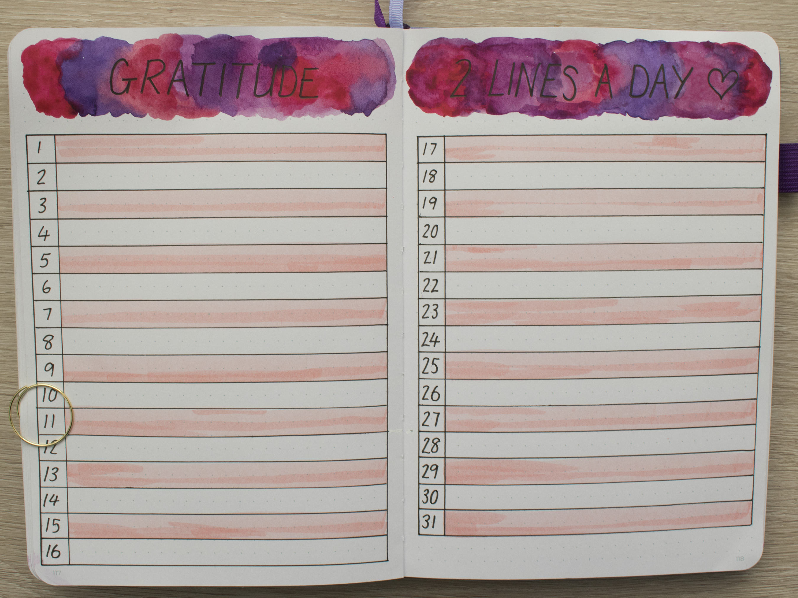
2 lines a day Gratitude Log
Photo credit: Laura Jones for Keeping It Creative
I’ve really enjoyed filling in my gratitude log each evening for the last two months and it has become very much a part of my routine. This is the same set up as before with the addition of some watercolour behind the heading. I used the wet into wet technique so the previous and next page have gone a bit wrinkly but I’m pleased with how it turned out so I don’t mind too much!
For my daily entries, I include simple things such as the supermarket having my favourite sandwiches in stock for our picnic, paracetamol to ease my foot pain and a new yoga sequence on YouTube to try. There are so many benefits of practising gratitude, one of which is increased optimism so I highly recommend it.
Yoga session tracker
Photo credit: Laura Jones for Keeping It Creative
I’ve been doing yoga for well over a year now. I started attending a class but it was quickly cancelled due to COVID-19 so I now do sequences from my favourite YouTube Channel Yoga with Lin and Leo. I miss the chance to have input from the teacher and I’m looking forward to the chance to interact with others in a class but I’ll definitely continue to use the channel to practise regularly at home. This line a day tracker allows me to record my sessions in brief and identify my rest days. Hopefully, some day soon, I’ll be able to write down some face-to-face classes!
May Memories
This is another spread I’ve been doing for a few months now. It’s a place to record anything of note that happened such as a wildlife spot, lunch with a friend, interesting purchases, places visited etc. I’ve left the décor minimal so I’ve got plenty of room to write. Before photographing, I wrote a memory from yesterday so that you can see what my entries look like.
Photo credit: Laura Jones for Keeping It Creative
That’s all of my initial spreads for this month. As I’ve said before, I don’t draw up weekly plans anymore as I just end up wasting space if there’s not much going on that day or I end up filling days with to do lists of things that really don’t need to be done on a specific day.
Final words…
I hope you’ve enjoyed having a sneak peek at my spreads for May even if I shared them a little later than planned. Don’t forget to let me know in the comments what theme you’ve chosen this time and if you’ve shared your pages on your blog, I will be sure to check them out. Hopefully next month I’ll find the time to get cracking a little earlier and the lighting will be more conducive to taking photos (the April showers have saved themselves up until the final week of April and have then continued on into the first week of May).
A few weeks ago, I shared my experiences of using the wet on wet method for watercolour washes. Today, I’m going to show you the results of some really cool wet on wet techniques using a range of household items which you should already have readily available to you. Let the fun begin…
Applying cling film
This technique is so easy to do but creates some really amazing effects. Simply wet your paper with water and then apply either a single paint colour or blend several together. Next, apply your cling film over the top, allowing it to crinkle in various places. Place a weight over the film e.g. a heavy book and leave it to dry. Remove the cling film and admire the weird and wonderful results (left hand image).
You can also work a different way where you place the cling film flat onto your table, add some clean water and then apply pools of paint directly to the plastic wrap (you could try maybe two or three different colours. After doing this, place your watercolour paper directly on top of the cling film. Flip it over and then either leave the plastic wrinkled where it is or move it around slightly to disperse the colour. When you’re happy with your creation, carefully remove the cling film and leave your paper to dry (right hand image).
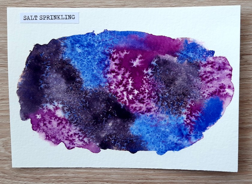
Salt
For this one, you need to search for some salt in your kitchen store cupboard or pantry – any kind will do but I used some coarse sea salt which we had in our mill. I attempting this technique quite a few times and I got different results, some more interesting and effect than others. Begin by wetting a small piece of paper with clean water. Now paint the area with one, two or three colours. Ensure that the area is damp and shiny but not too wet. Dry off any excess with small amounts of kitchen towel if you have any puddles. Add a small amount of salt either by pinching and sprinkling it or using a mill like I did. Let the paint dry and leave the salt to work its magic. Brush off the salt with your hand or use a small ruler to gentle scrape it away.
Applying rubbing alcohol
This was one of my favourite techniques. Rubbing alcohol AKA surgical spirit is usually part of our first aid kit (I use mine to clean my silver earrings too!). But did you know, you can use it to create some interesting effects on wet watercolour paint? Place a small amount of rubbing alcohol into a dish and put aside for later. Wet the area of your paper you want to work on and then add some paint. Now, dip your finger or a cotton bud (I used a cotton bud for the first example) into the surgical spirit. Tap your finger or the cotton bud onto the painted area. Repeat as many times as you like. You can also use cotton wool balls for larger blobs (as shown in the second piece).
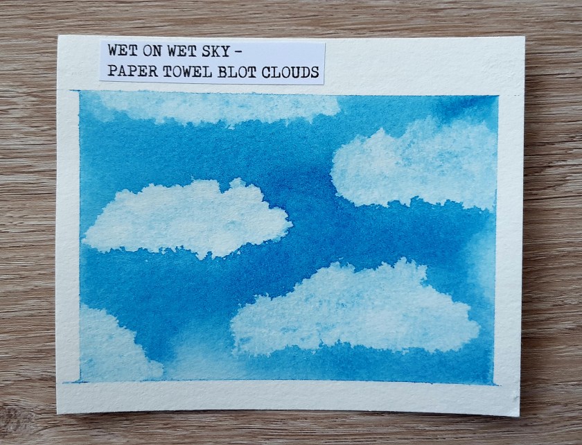
Lifting paint with paper towel
This is also a good technique to use if you make a mistake in your work or you have excess pooled paint or water on you paper. Mask off the edges of your paper for a clean line around the edge. Wet the whole surface until it is shiny and then apply a wash of colour. Use a scrunched up piece of kitchen towel to blot away the colour. As you can see, I made little cloud shapes in my mid blue sky wash. Doesn’t it look great?
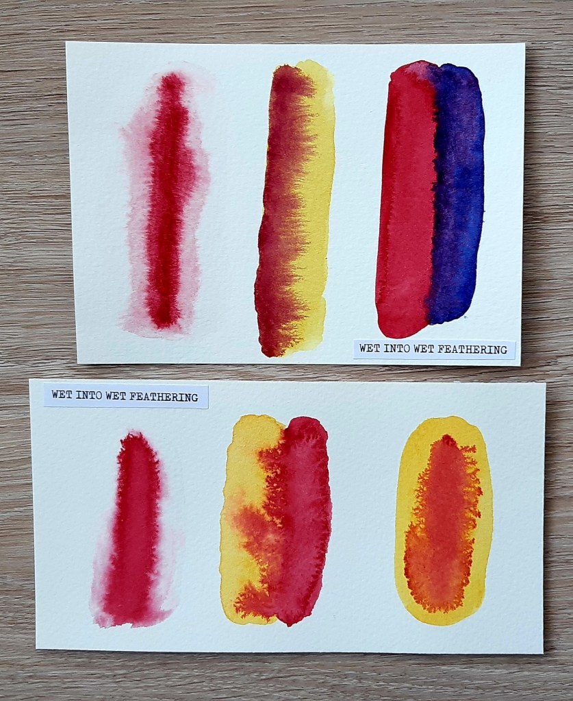
Feathering
You can feather the paint in a range of different ways. The first example (on the top and bottom paper) involves wetting a section of the paper and then applying a single stroke of slightly diluted paint in a downwards motion. This causes the colour to spread to create a feathery effect. For the second examples (number two and three on the top paper and in the middle of the second paper, I applied a strip of pinky red and then applied another colour in the same shape, touching the very right hand edge of the first colour. This causes the first colour to feather into the second and vice versa. The wetter and more diluted your paints the more it feathers. For the final example on the second piece of paper, I applied yellow paint and then rain a strip of pinky red down the centre.
I thought these techniques would be good for using to create variegated tree bark and petals. Do you agree?
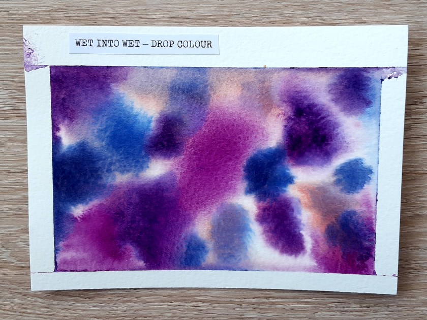
Blooms and drop colour
Another really simple but effective technique is to drop colour onto a pre-wetted piece of paper. You can either apply lots of drops using a large brush to blend the colours or you can drop small blobs of paint and watch them bloom. Again, the wetter the paper and more diluted the colour, the more the paint will spread.
As you can see, I had a little bit of a problem with the paint leaking under the masking tape on the second one. I’m not sure if I applied too much water or if the cheap three rolls of tape for £1 didn’t help the situation!
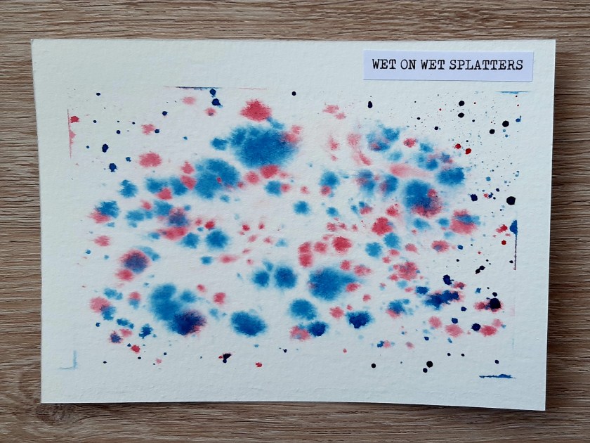
Splattering
I covered this technique in my wet on dry post but as you can see, the splatters look different when applied to wet paper. On this example, below, the paper was wetter in the centre and so the splatters there spread further than those at the very edge of the area.
I hope you have enjoyed looking at my watercolour experiments. I had great fun exploring the different techniques and found it really calming and relaxing. If you’re looking for something creative to do during lockdown I would totally recommend giving it a go and I think it would be something great to do with kids too.
Last week, I wrote a blog post all about wet on dry watercolour including basic washes and fun techniques you can try to get interesting effects. This week, I’m exploring wet on wet washes and cool effects. Again, I’m sharing what I have learnt and some photographs of my actual work which I hope you will agree, isn’t too bad for a beginner!
What is ‘wet on wet’ (or wet into wet)?
As the name suggests, wet on wet refers to using wet paint and applying it to wet paper. It is also used to describe the addition of another wet colour to wet paint which is already on the page (commonly known as charging).
The wet on wet method is great for creating smooth transitions between colours, gradient effects and soft lines and edges. Artists typically use it for painting landscapes, simple skies and soft, flowing washes. Wet on wet can be a little unpredictable but that is what makes it so exciting as you are never absolutely sure of what you are going to get.
What are the issues with using the wet on wet method?
There are a few things that can go wrong when using wet on wet so it’s a good idea to explore the technique using small pieces of cheaper watercolour paper like I did before embarking on a larger piece. You will definitely find that you run into a range of issues along the way when you are experimenting but that’s part of the learning process and the fun of working with watercolour paints.
As you are working with very wet paper, one of the issues that can arise is paper buckling or cockling. This is more common (or pronounced) with thinner paper but can happen regardless of how thick your paper is. So why does it happen and what are the problems with it?
When the paper fibers absorb water they expand lengthwise, and they take on a more random alignment. When the paper dries, the fibers contract again. But to some extent the fibers retain their irregular alignment. This change in the structure of the fibers is what causes raised ridges and low valleys to form on the surface of the paper which we see as buckling… ridges and depressions… make paint flow difficult to control. It’s a nuisance which all watercolor artists have to deal with. This is pretty annoying because as you continue to paint, pigment tends to run into the low valleys and settle in pools. Stretching your paper is the common solution.’
Anthony @ Watercoloraffair.com
The method I used for stretching my paper was to soak it by immersing it in a tub of water for 5 minutes until it turns limp. As my cheaper watercolour paper is only 200 gsm this is all of the time that was needed because the thicker the paper, the longer it needs. I then fastened the wet paper to a plywood board and taped the edges with masking tape before leaving it to dry overnight. Unfortunately, the masking tape I have is pretty cheap stuff and so it doesn’t particularly stick very well.
Another issue can occur if you use too much water. If you soak your paper and use heavily watered down paint, you can end up with ugly marks on your paper. I’ve seen a range of names for these including ‘blooms’, ‘blossoms’, ‘backruns’, ‘cabbages’ and ‘cauliflowers’ but they’re caused when the paint runs to the edges of a pool of liquid. You can avoid these by controlling the amount of water you have on your page by wetting your paper evenly all over until it has a nice sheen to it and then only slightly dampening your paint with a small amount of clean water. If you do find that water collects on your paper, you can use a dry brush to soak it up or a small amount of kitchen towel to absorb the excess. You especially need to check the edges of your work where you have affixed the tape as liquid has a habit of collecting there! I found the best way to learn is by experimenting to see what works best. I bought a few blocks of 10 A4 sheets of cold press paper, then cut each sheet into smaller pieces.
The final issue I want to mention today is the opposite to the previous problem – not using enough water. With the wet on wet technique, it’s very important to ensure that your paper is nice and damp. To ensure your work surface doesn’t dry out you should mix all of your colours first before wetting your paper. You also need to make sure you work quickly which can be hard when you first start out as you are concentrating on ‘getting it right’. This is why it helps to do some exploratory pieces with cheaper watercolour paper so you can get used to how the paint behaves.
Wet on wet washes
Using the wet on wet method has the advantage over wet on dry because it prevents lines of paint being seen. This ensures your wash is smooth and even whether you are creating a flat wash, graduated wash or variegated wash.
For the flat wash, first prepare your puddle of paint by adding a small amount of water to your pigment (you don’t need a lot as the water on the paper will dilute it further). Next, wet your paper all over with clean water. I used a large flat wash brush for this as it enabled me to work quickly. When you are applying the paint, you don’t need to be as careful as with the wet on dry method because the mixture will spread easily. You do, however, need to ensure that you are not left with any excess watery paint so remember to use a dry brush or small amount of paper towel to mop up any excess moisture so you don’t get those backruns I mentioned earlier.
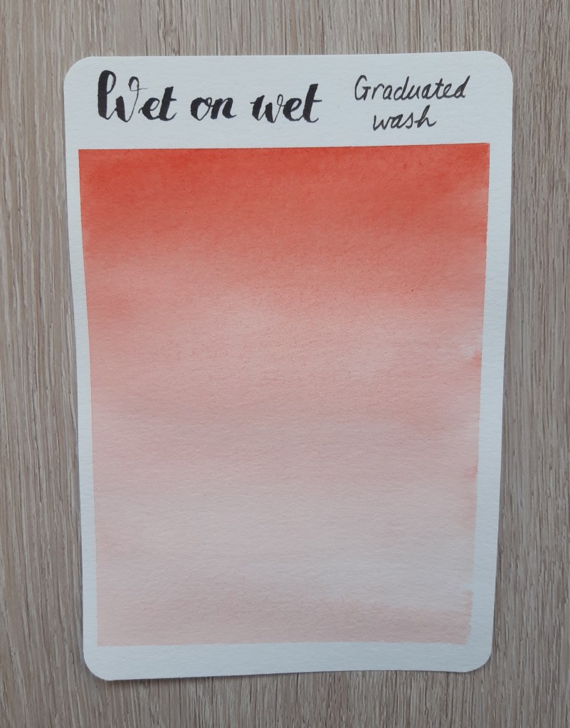
For the graduated wash (also know as gradient wash), you should make a puddle of barely diluted paint then wet your paper evenly as with the flat wash. Then take some paint and sweep from one side of the paper to the other (if you read last week’s post, you’ll know that I suggested working from right to left if you are left handed like me). Then for each new sweep, you’ll need to add a little more water to the mix or to the brush each time. When you reach the bottom of your paper, the wash should be almost completely transparent. It helps to have your board on a slight incline for this to encourage the paint to seep down the wet paper.
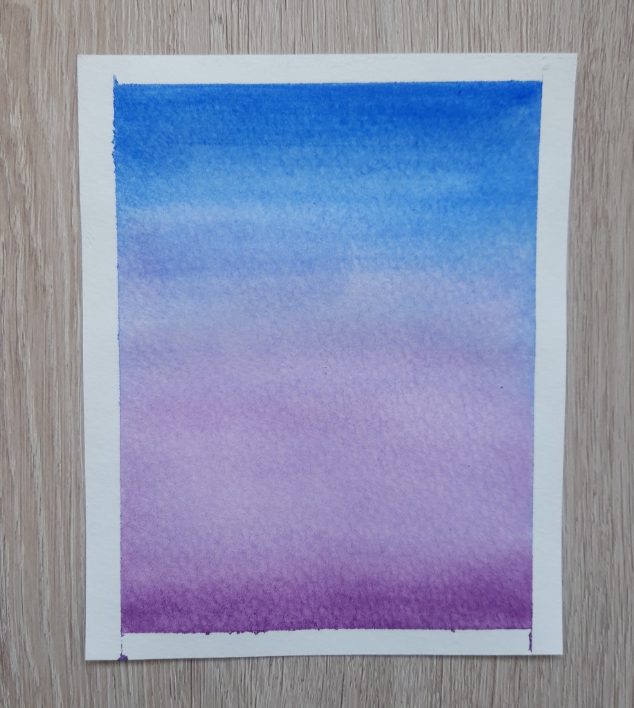
Finally, for the variegated wash, create two fairly concentrated puddles of paint in your palette. Then, wet your paper as before. If you want a smooth transition between colours, you may want to tilt your board again. For this, sweep your first colour on in horizontal strokes either to the end of the paper or to somewhere near the centre. Then, rinse and dry off your brush a little on paper towel before adding the second colour to the still wet paint. Because the paper is wet, the two colours will blend together to create a variegated effect (Image 1). If you want a more random mixing of colours, you can simple tap colour onto wet paper in whatever pattern you like so it blooms and spreads (Image 2). Then do the same with your second colour. You can use as many different paint colours as you like but I recommend sticking to about 3 so that you don’t end up getting muddy brown colours when they bleed into each other. Like with the other washes, look out for pools of paint that you need to soak up with a dry brush or paper towel to avoid backruns.
That’s all of the wet on wet techniques I’m going to share today because I’ve run out of watercolour paper and have decided to order some more online to enable social distancing! I’ll post the results of my experimentation either next week or the week after depending how long it takes for my order to arrive. Hopefully, I won’t get as much cockling with my new paper as it is quite a bit thicker than what I have now.
Until next time, keep finding space in your life to be creative during this lockdown period and if you have any finished projects to share on your own blog, let me know in the comments and I’ll be sure to check out your work.