Hi all! It’s been a while since I last shared my monthly BuJo pages, but, as I’ve finished my July spreads super early (I actually finished the last few bits over a week ago!), I thought I’d get the various pages photographed and uploaded to my blog so you could see my finished designs and chosen theme. Obviously I’ve used stickers but you could quite easily simplify the pages and hand draw and colour different strawberry (or other fruit) themed images.
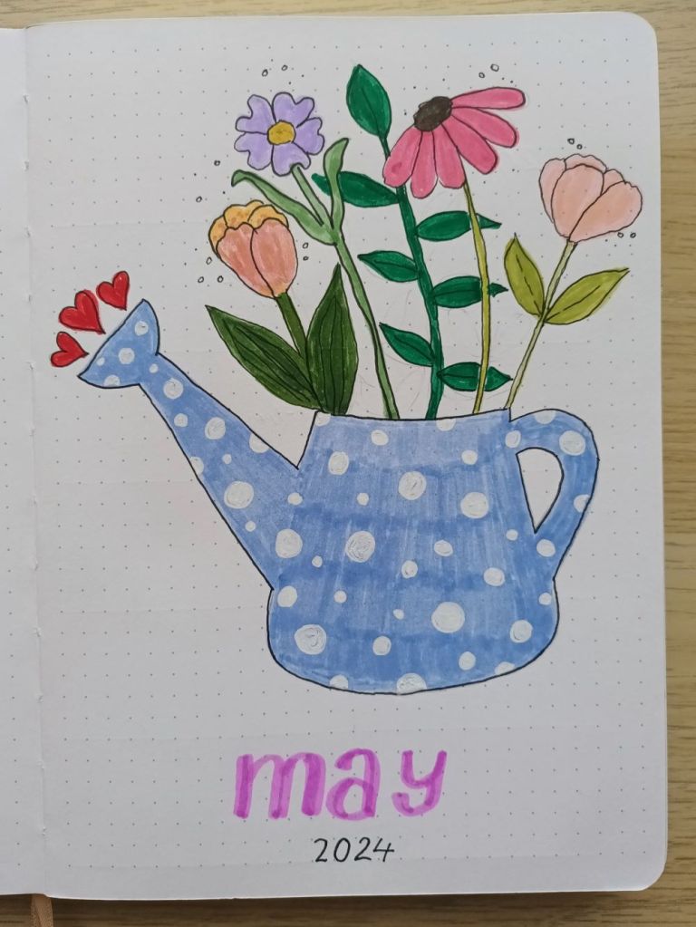
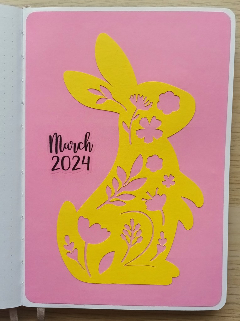
The front cover
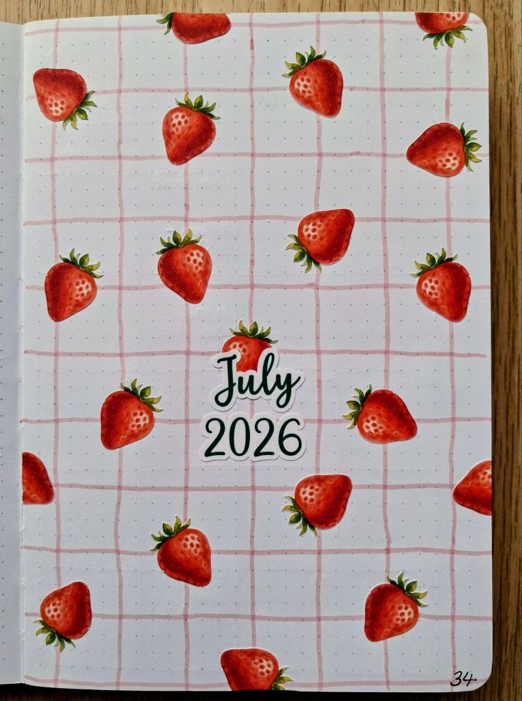
I wanted to create a slightly thicker grid than the one above but I only had a Tombow pen in the colour I wanted so I used the bullet tip for it. I created strawberry stickers with no white border for a clean look and I was pleased with how well my Cricut Joy Xtra cut out the images. Overall, I think the page looks quite cute!
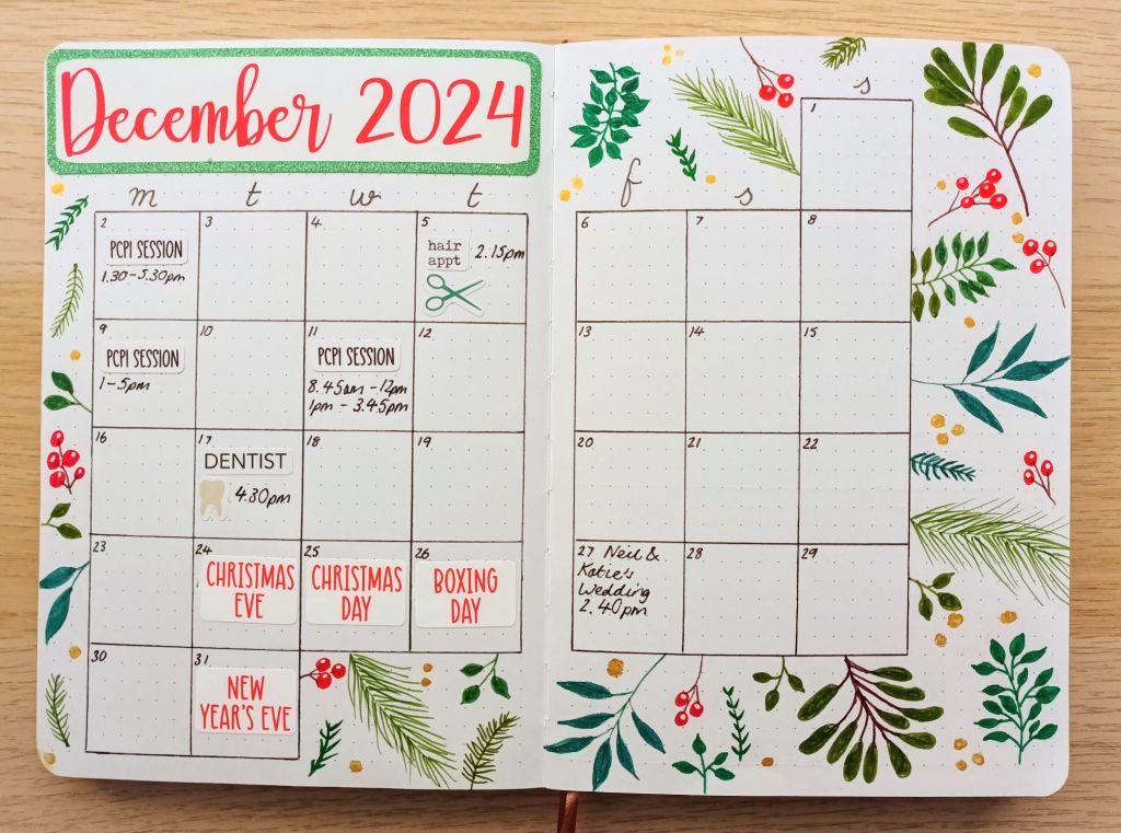
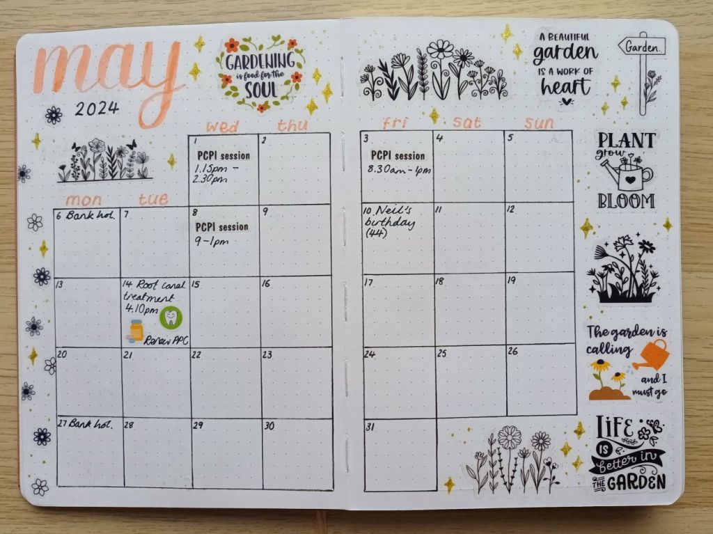
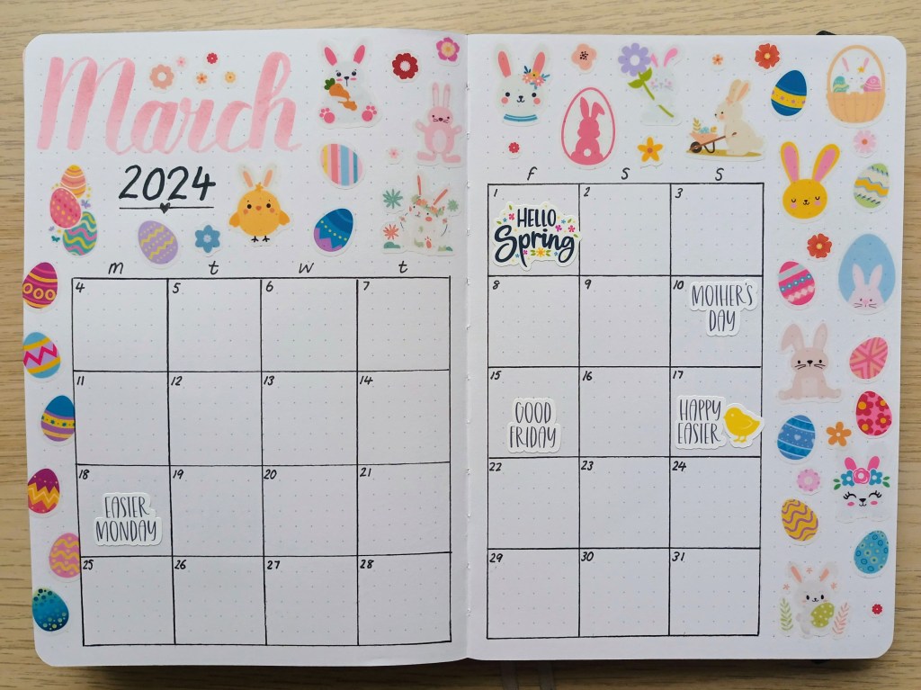
Monthly calendar
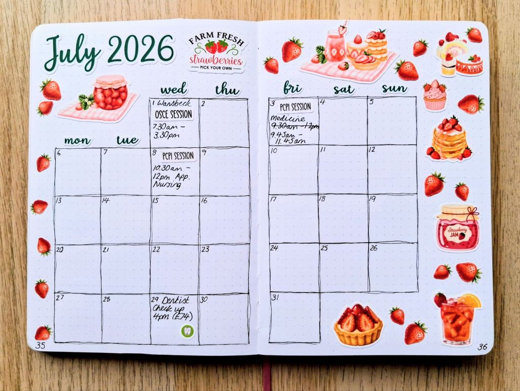
I already have quite a few things happening in July so I was glad to have my calendar ready early so I had a space to put them after initially adding them to my future log. I love how bright and colourful the spread turned out and, if you’ve been following me for a while, you’ll know that strawberries are my absolute favourite fruit and so this theme was a great option for me this month.
The calendar is the usual six by six dot grid spaces as I find I have just enough room to write in all (or most) of whst I need to add.
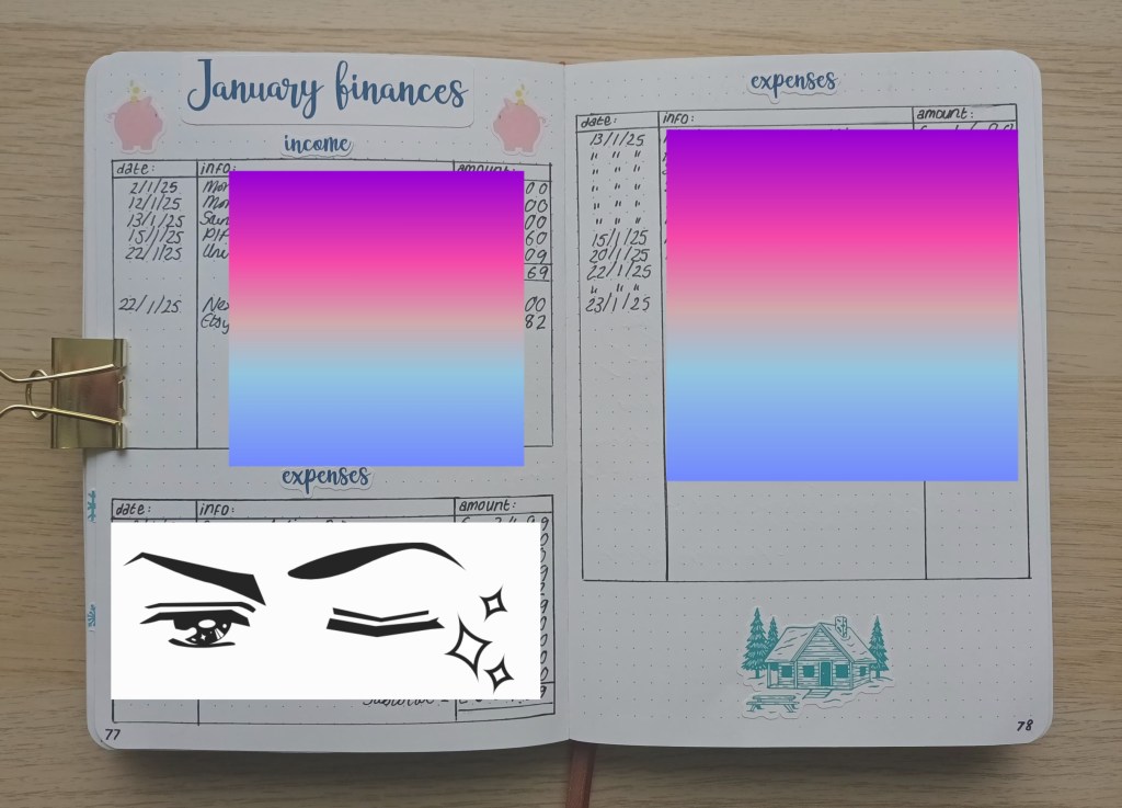
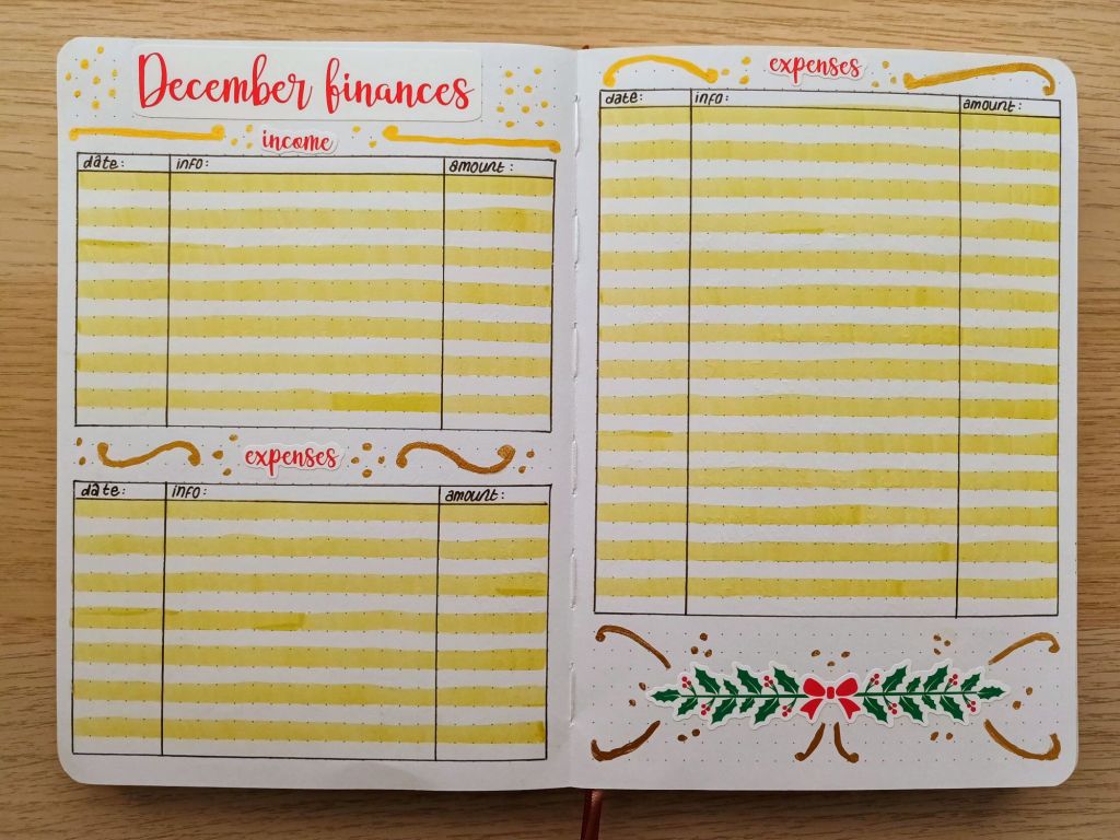
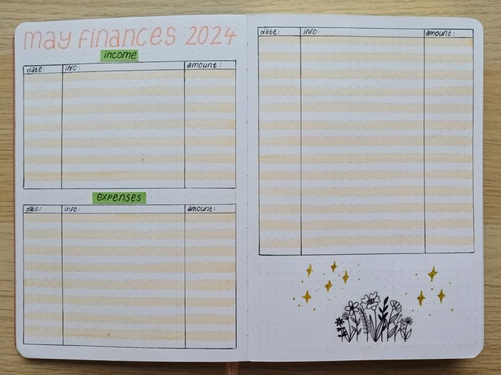
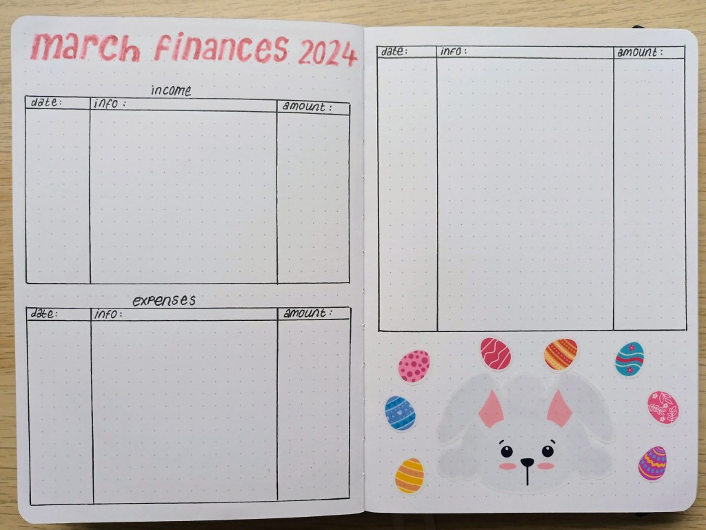
Finances – income and expenditure
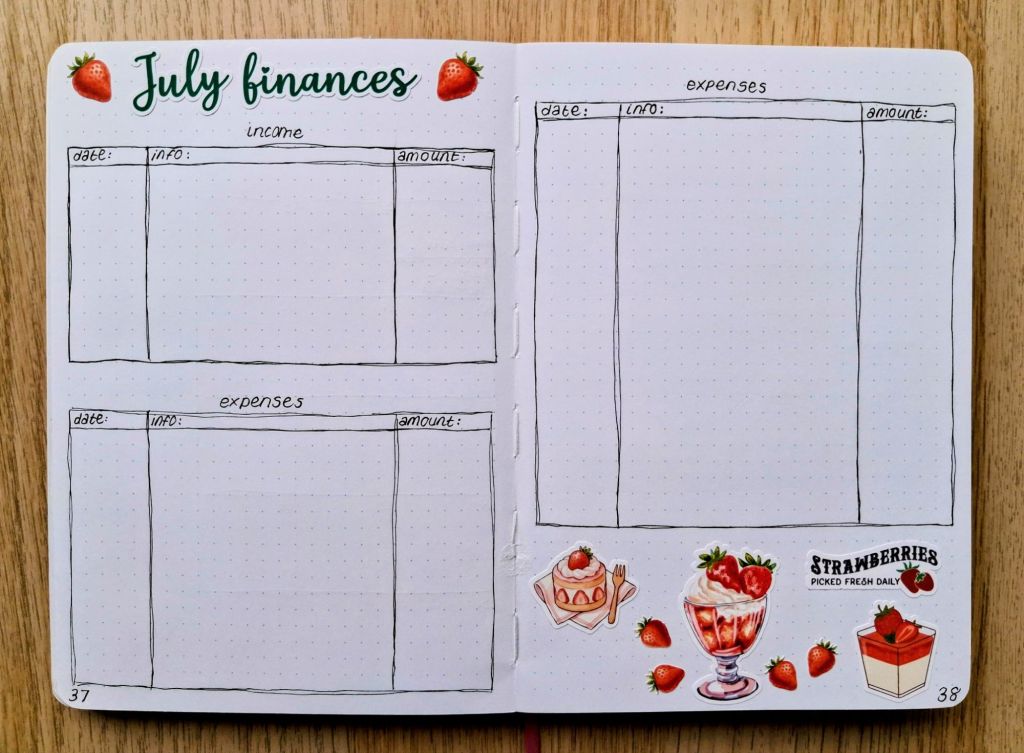
This month, you may have noticed that I appear to have forgotten to use a ruler. Actually, I did it on purpose and it made it sooooo much quicker to do the grid for my calendar and the finances log. And, to be honest, I think it looks okay, and I might do it again and again for the rest of 2026! I saw a tip on a YouTube video (might have been Shayda Campbell) about using two hand drawn lines to show that the wobbly bits are intentional and it certainly doesn’t look as messy if you’re ruler accidentally smudges things or if you accidentally move the ruler.
Reviewing the previous month and getting ready for July
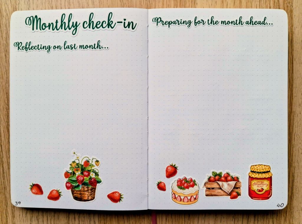
I started creating this spread as a way to think about how things went the previous month including what went well, what didn’t go as planned, changes I might make the next month and anything that I needed to look into to help me going forwards. It’s also a space where I can record any actions I want to take before I start to work towards my monthly goals. For example, this month, I need to read information on the Brockbushes website to find out when the strawberry picking is, how much it costs, what’s on the lunch menu at the cafe there (we can’t just eat strawberries all day), how long it takes to get there and what photos I might want to take so I have a nice record of what we did and any displays they have.
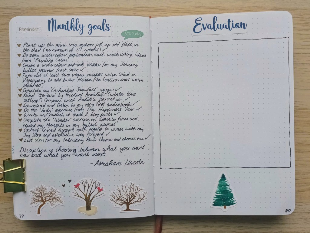
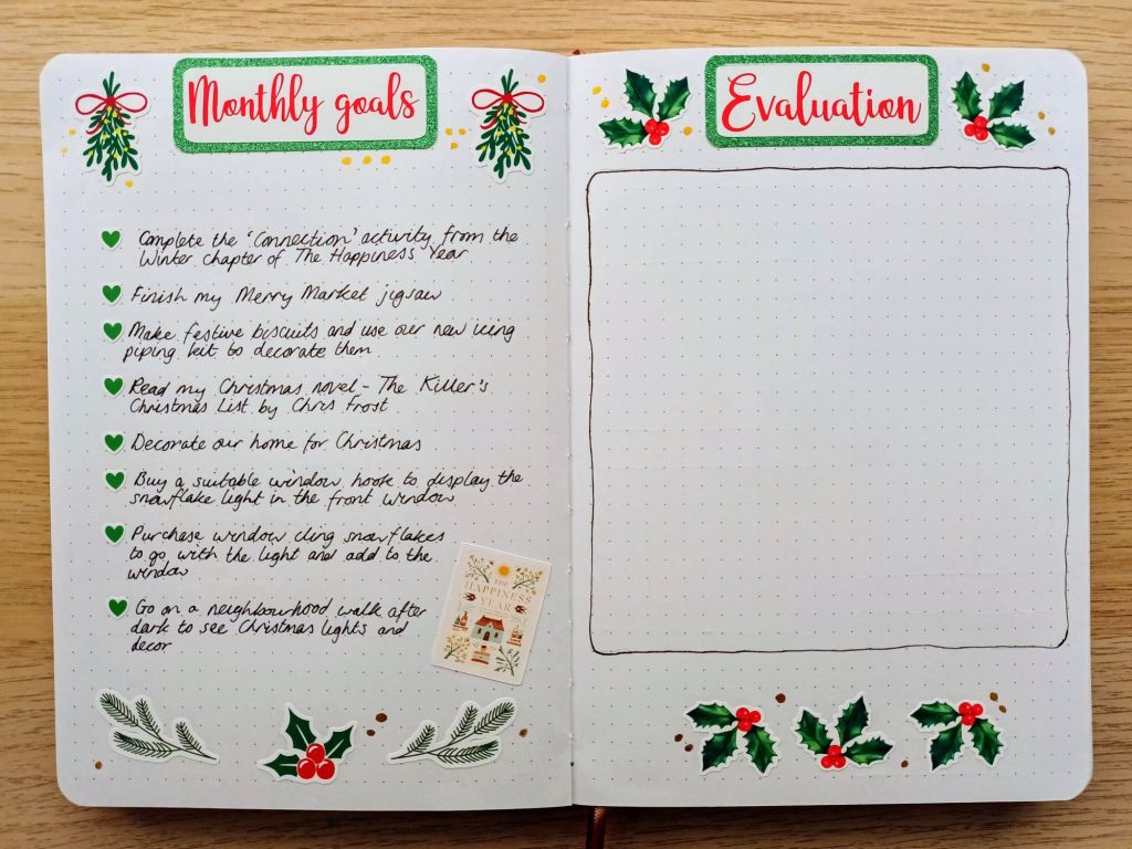
Monthly goals and space for evaluation
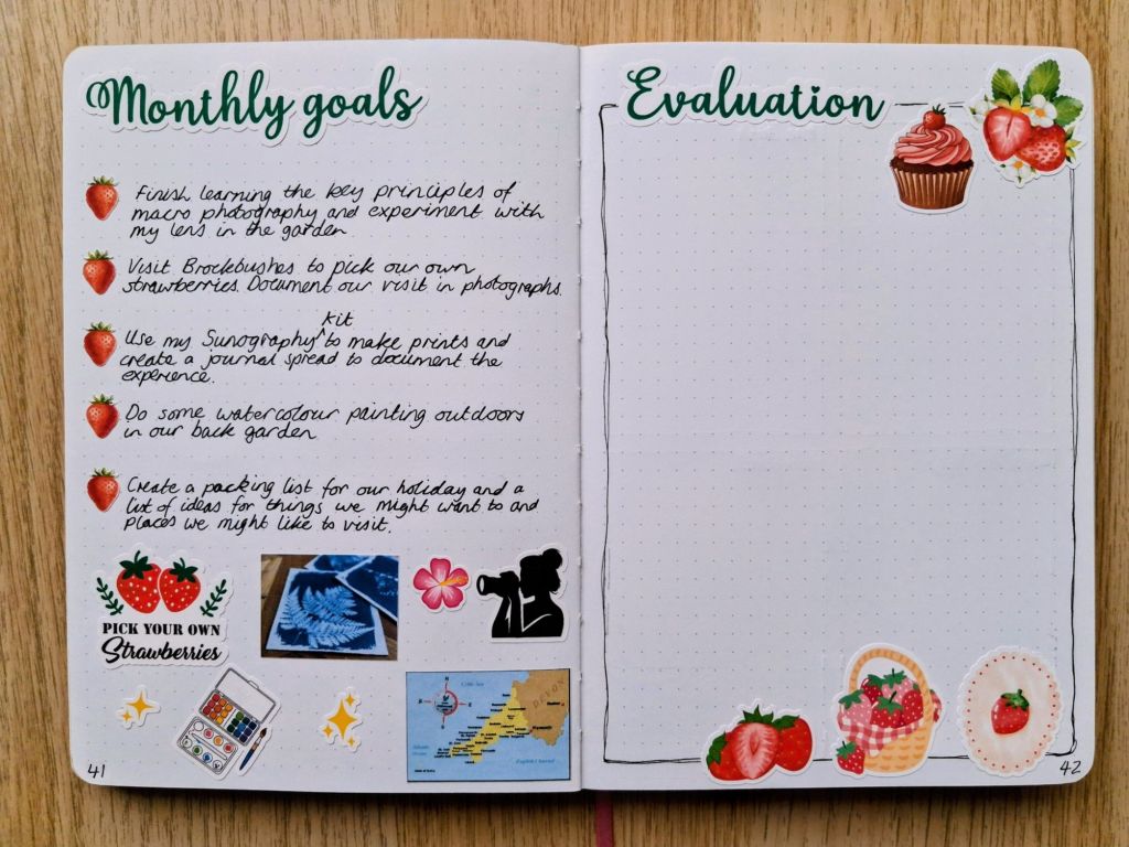
I tend to choose about 4 or 5 goals each month, sometimes related to hobbies or experiences I want to have, usually at least one related to my blog or Etsy shop (not included this time as I did a lot of work in June and now, a personal curriculum aim. These fall outside of the time I spend at work and I’m mindful of how much time I will have depending on my hours. In July, I have quite a lot of commitments and I’m getting sessions through regularly (2 since I photographed my spreads) so realistically, I can’t made my goals too lofty or I’m setting myself up to fail.
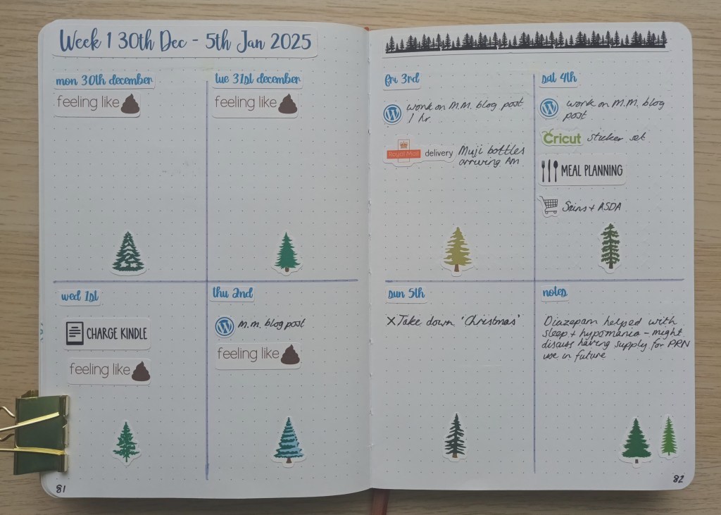
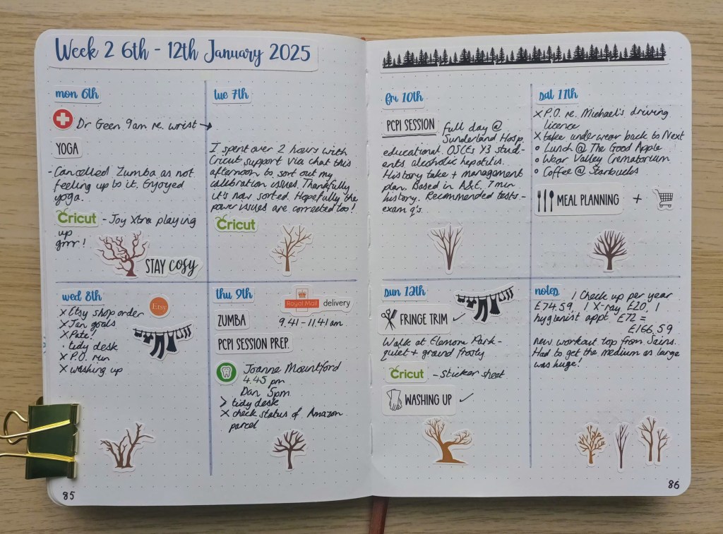
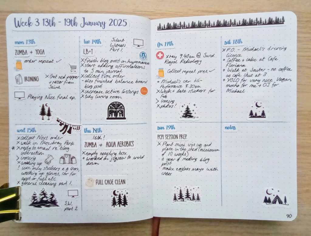
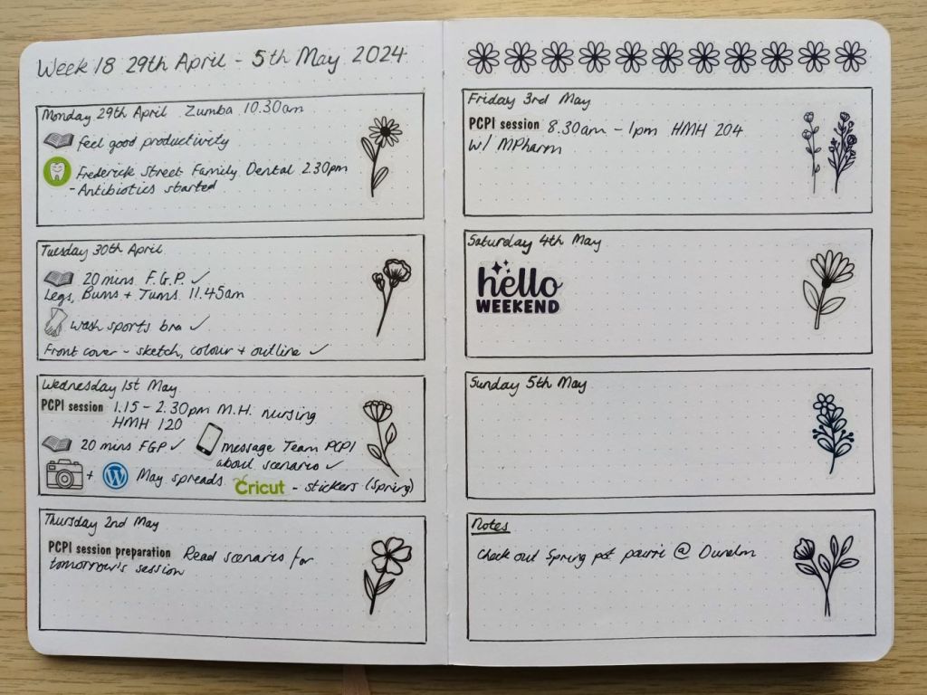
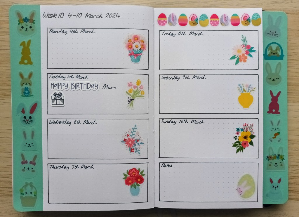
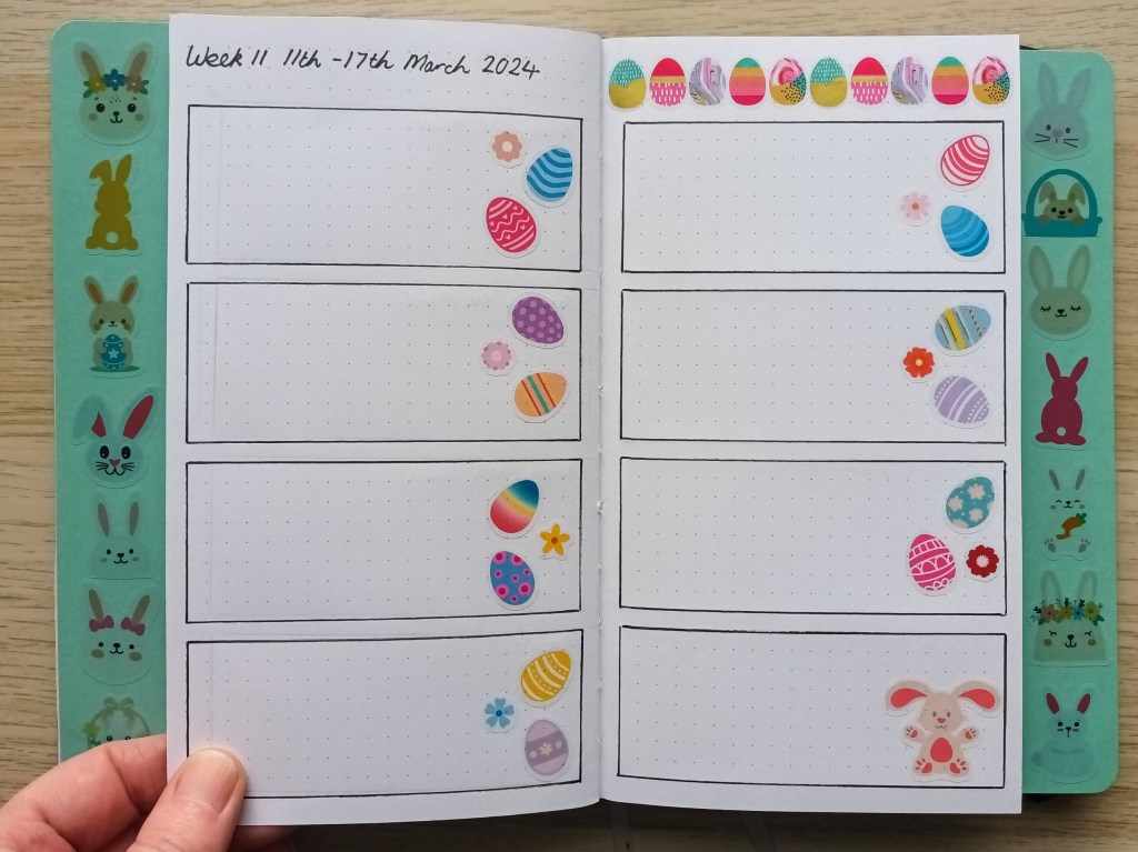
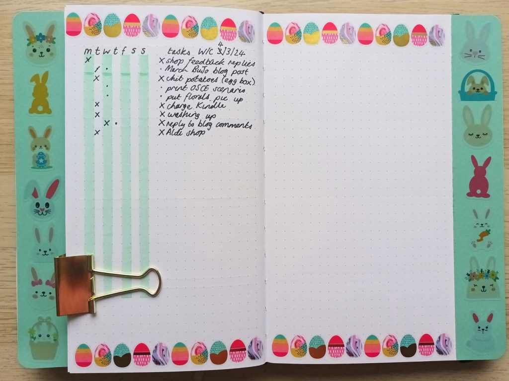
Weekly plan
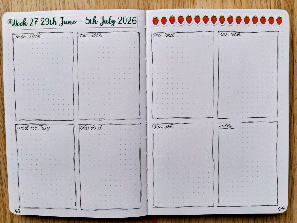
I made all of my weekly plans the same for July so I’m just sharing one of them as an example. I kept the decoration very minimal but I do have some spare strawberry stickers if I want to add some later.
Final words…
I hope you’ve enjoyed seeing my pages for the month of July and are suitably impressed with how early I’ve got them finished (ha ha!). I appreciate that not everyone has the time and inclination to create such highly decorated spreads but for me, it’s really one of my hobbies and something I find a fun, relaxing and mindful activity. I also think I’m more likely to use my planner functionally if it looks pretty! I check in with my bullet journal every day, and throughout the day if I’m at home, and it really works to keep me organised and on track to succeed in creating a life I love.
Wishing you a joyful July,