Posted in art, compassion, creativity, Planning and journaling, Setting goals and intentions

Creating a lockdown vision board

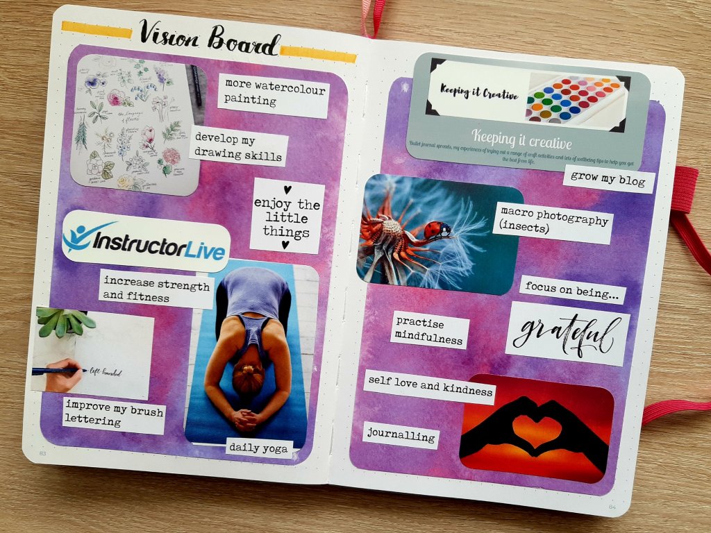
With the country in lockdown for the foreseeable future many of our routines will have changed and so will our priorities in life. With this in mind, I decided to create a vision board which focuses on what I want for myself right now. This post is all about how I made it and includes a brief explanation of each of the elements. I’m really pleased with how it turned out.

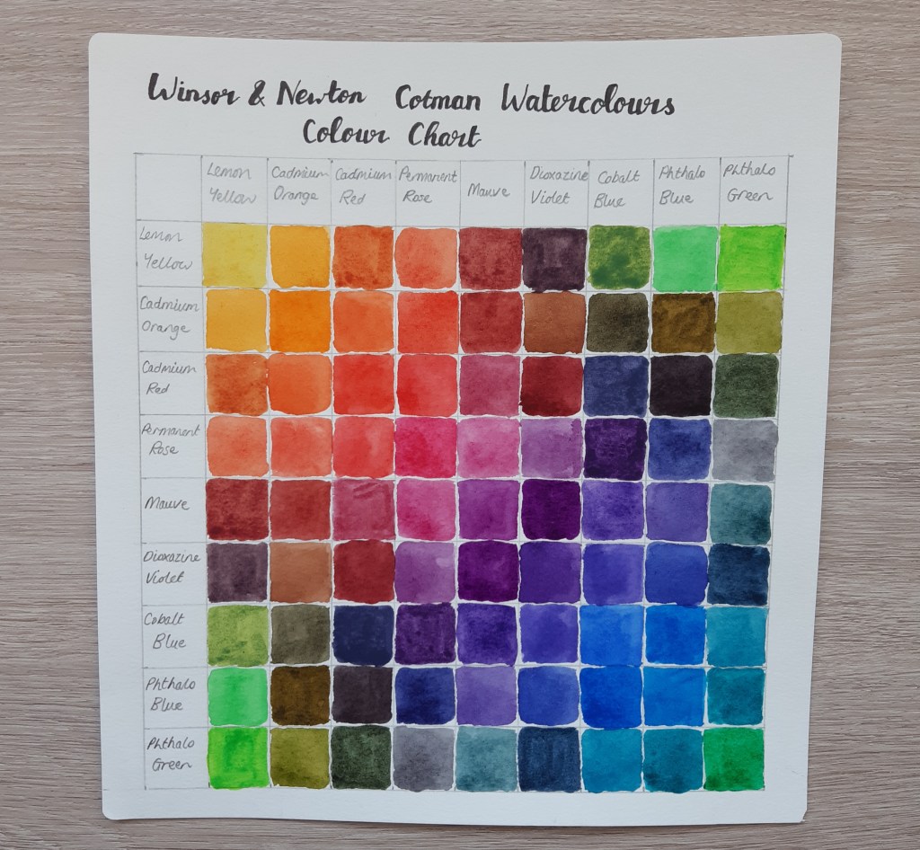
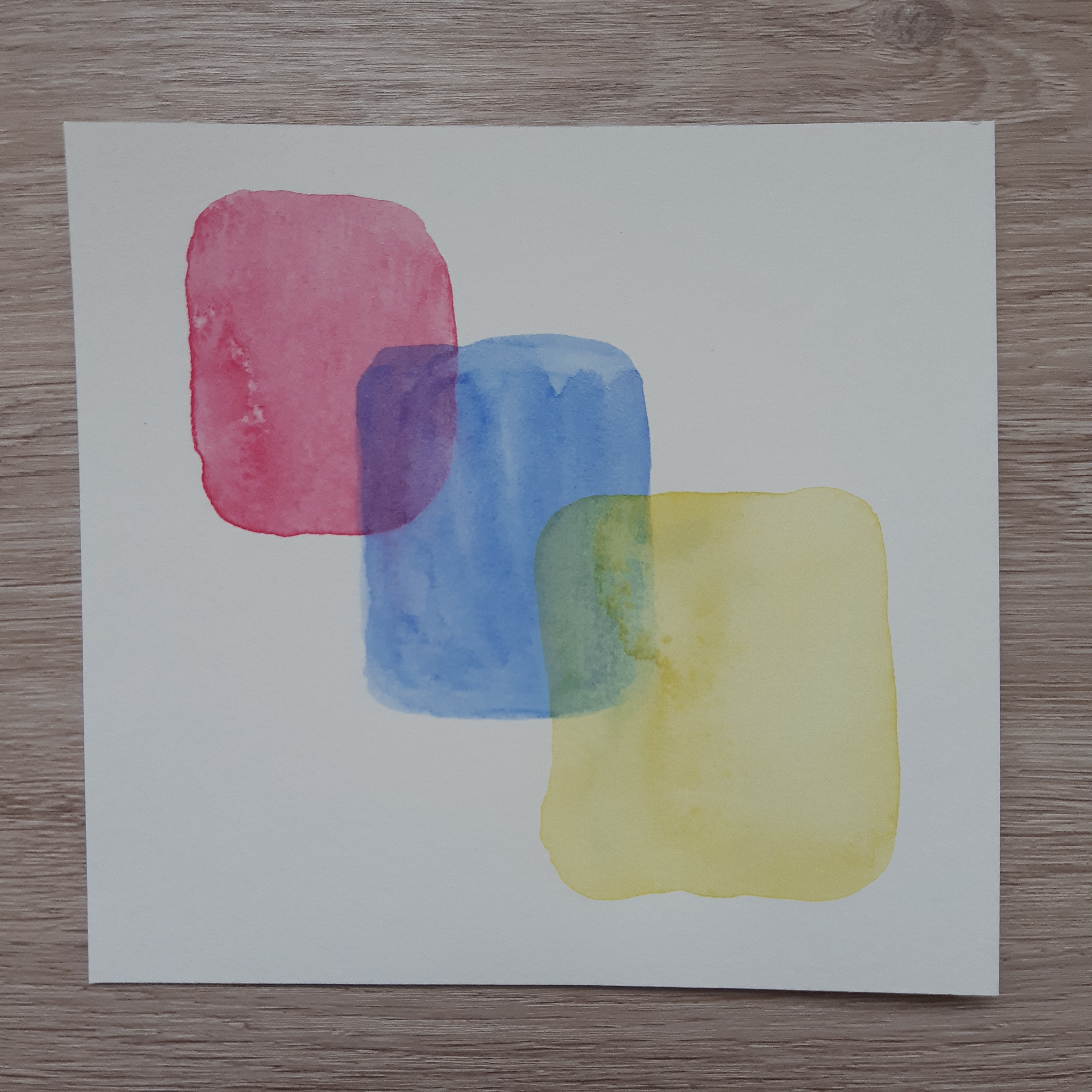
As one of my goals for the moment is to experiment more with watercolour techniques, I created the background for the board by using a wet-on-wet technique and a limited palette of three colours. I used coldpress watercolour paper which did wrinkle a little but you couldn’t tell when I put it into the photocopier part of my printer. I copied it twice and then orientated them differently to create the two page spread.

After creating the backdrop, I thought carefully about my hobbies and interests and how I can engage in them further. I came up with nine ideas:

  1. to work on my drawing and painting skills
  2. to increase my strength and fitness
  3. to continue to work on my brush lettering (being a leftie makes it hard!)
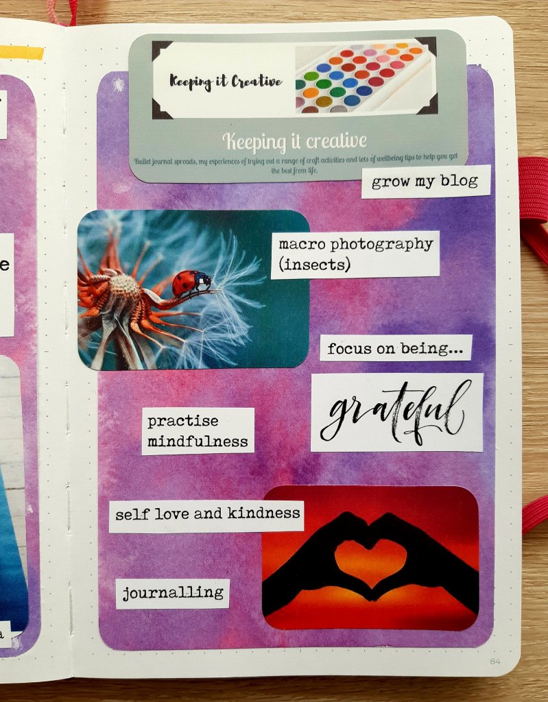
  4. to grow my blog by posting regularly
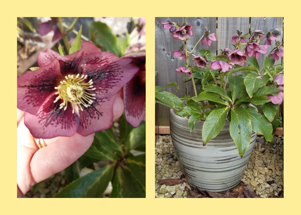
  5. to develop my macro photography by using my DSLR in the garden to snap insects
  6. to focus on being grateful for my life even in these difficult circumstances
  7. to practise mindfulness to enable me to live in the moment more
  8. to use my compassion based learning to improve my self love and kindness
  9. to do much more journalling

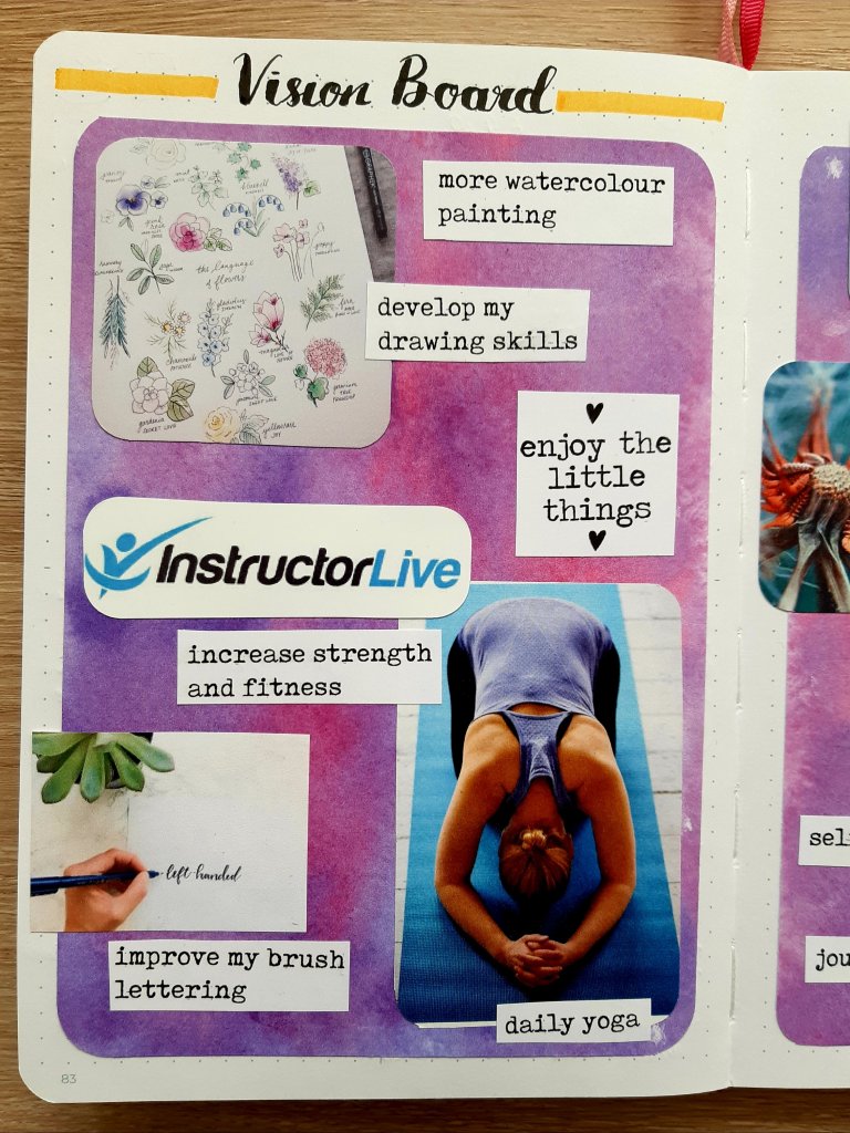
Drawing and painting

There are some amazing online tutorials out there and I’ve already subscribed to a number of YouTube channels. One of my favourites at the moment, is Shayda Campbell’s florals work which includes lots of sketches of flowers and watercolour techniques which are really easy to follow. Another arty channel that I’ve recently started following is Hullo Alice for watercolour tutorials and bullet journal spreads.

Strength and fitness

I’ve already mentioned my daily yoga practice in a previous post and I’m continuing to develop my ability to do a variety of poses. The style I do is called Iyengar and I’m currently using this channel. I’ve recently ordered a folding chair which I’m hoping in sturdy enough to use.

Brush lettering

I’ve been doing brush lettering using my Tombow dual tips and Fudenosuke hard tip pen for a long time now but still find certain letters difficult. I’ve decided to practise more by doing the lower and upper case alphabets on alternate days and at least one quote per week in my BuJo. The practise sheets I’ve been using are from the magazine publication Simply Lettering. I’ve already made progress but I still think it’s super hard for lefties like me!

This blog

Whilst I was struggling with depression and anxiety I really didn’t have the confidence in myself to work on my blog. I had no ideas and no inclination to put pen to paper. But now, I’m pleased to say that I’m brimming with topics I want to write about and the words flow onto the page with ease. I’m back doing my Monday Matters series and I’m enjoying using my bullet journal again. Also, I hope to share with you some of what I’m doing to work towards the items on my vision board.

Macro photography

My DSLR has been in its case for months now and I’ve just been using my camera phone to take the odd snap. I splashed out on a macro lens a couple of years ago but haven’t really experimented much with it yet. I figure now, as we’re getting lots of insects in the garden, would be a great time to work on developing my skills in this area of photography. I’m not saying I’m going to get shots as wonderful as the one on my vision board but I’m going to give it a go!

Gratefulness

It’s easy to focus on all of the negative aspects of the lockdown but that’s a guaranteed way of getting myself depressed again so I’ve decided that one of the things I’m going to do each day as I socially distance myself, is to record what I’m grateful for. I bought a journalling book from Paperchase a while back called ‘5 Minutes Before Bed’ which includes space to write down your thoughts. There are a variety of different prompts and motivational quotes to keep me focused.

Mindfulness

I attended a mindfulness course at my local wellbeing centre last year and found it really beneficial. However, I haven’t really kept up the practise and really struggled to stay mindful during my period of poor mental health. But, I’m determined to focus on living in the moment and I’ve bought a journaling book to help me do this. The book provides a variety of activities to do to increased mindfulness and a space to write how you got on doing each task. I intend to do a blog post on this when I’ve completed some more of the book.

Self love and kindness

When you are struggling with your mental health, self love and kindness tend to go completely out of the window. I personally found that I had no capacity for self compassion and would constantly beat myself up over how I was feeling. Now, with an increase to my medication, I’m well again and able to show love and kindness to myself and others. I chose the bright heart hands image to remind myself that whilst working towards my goals, I want to remember to approach things with a gentle kindness.

Journalling

I’ve already mentioned the two journals which I’m using at the moment but I intend to reflect on how I’m doing my writing in my bullet journal regularly too. I find journaling really therapeutic and an important way of focusing the mind so it’s definitely something I want to do each day.

I hope you’ve enjoyed reading about my vision board. As you can see, I’ve got plenty of ideas for self development that I want to put in place over the next few months. Maybe it’s given you inspiration for things you’d like to do whilst in lockdown mode. However, if this is not where your head is at right now and you find yourself lacking in motivation due to the current situation, then just accept that this is the case and focus on self care and self love to get you through. There’s nothing wrong with having lots of down time right now as you get used to life whilst social distancing. However you intend to structure your life in the coming weeks, remember to keep safe by keeping your distance and celebrate any small achievements along the way.

Until next time, take care,

Posted in creativity, Planning and journaling

Setting up my bullet journal for April 2020 – Hellebores floral theme

Hellebores in full bloom – March 26th 2020

For my bullet journal spreads for April 2020, I have taken inspiration from my own garden. This year, we transferred our hibiscus plant to a larger pot and it is now thriving and has so many flowers on it that it looks so pretty. I wanted to have a go at drawing the individual blooms and also the pot and plant. I hope my spreads inspire you to try out a nature theme this month too.

Drawing the flowers required a bit of research into drawing techniques but a quick Google search came up with a great tutorial that even I could follow with my limited sketching skills. Click here if you want to see how to create the basic shapes. For the colouring in of the individual flowers, I copied directly from my plant, but I relied on the demonstration to get the dimension and detail right.

I found this quote online and thought it was perfectly apt for me at the moment. I’m just starting to get better after a long spell of overwhelming anxiety and depression and with time and an increase to my medication I’m taking small steps towards the life I want. I accidentally stuck the piece of paper (which is incidentally covering my first version of writing the quote because I messed it up) on a bit wonky and couldn’t remove it as I used strong adhesive tape!

My April cover page is a simplified version of my actual hibiscus plant. I’ve drawn a smaller amount of leaves and a lot less blooms than there are in real life but I didn’t want to make the sketch too onerous. After drawing a rough image with pencil, I used a Unipin 0.2 black fineliner to outline the flowers, stems, leaves and pot and then coloured pencils from my WHSmiths set to do the shading. I’m quite pleased with the results although I think the leaves look a little un-natural as I made them a bit to uniform. Anyway, I’m just a beginner so there’s always something to learn!

My calendar page is a double spread as always, with boxes six dot spaces wide and tall. I like plenty of room to make note of each day’s events, including birthdays and appointments (although I just realised I probably won’t have any face to face contact with anyone this month due to COVID-19!). I’ve added a space for notes at the bottom in case I need to write about something at length.

I’m not tracking my habits this month as I don’t want to put the pressure on myself but I will be making sure to drink lots of water each day and need to keep applying moisturiser to my hands as they’re all dry and cracked from all of the handwashing. I’ll probably record my mood each day over the month but for this I’m going to be using the Bipolar Mood Scale chart to check that I’m not getting too hyperactive from trying to do too much in a bid to make up for all of the months I haven’t felt like doing anything.

I hope you’ve enjoyed looking at and reading about my April Bujo spreads. I’m excited to see what everyone else has chosen for their theme this month. Drop me a comment below if you’ve shared yours on Instagram, YouTube or on your blog and I’ll be sure to take a look. This social distancing has meant that many of us seem to have got our spreads drawn up well ahead of time – we’ve got to celebrate the positives, right?

Until next time, stay home, stay safe and stay well.

Posted in art, creativity, watercolour painting

Back to basics: Watercolour techniques Days 1, 2 and 3. More colour mixing and layering

As the colour mixing chart took so long to complete, I left the rest of the lessons for Day 1 and combined them with Days 2 and 3 for a mammoth painting session. Although I enjoyed the actual painting I was spending more time trying to clean up my set of colour pans and washing out the mixing palettes so in the the end, I popped to The Range and bought some squeezy tubes and two more mixing trays. This meant I had exactly the same colours as the painting tutor and I could leave my dollops of colour in the palettes to use at a later time. I learnt lots more about mixing colours and had great fun trying out the different techniques.

As I said in my first basic watercolour techniques post, the colour chart took me a long time to do, so although I watched all of the lessons for Day 1, I didn’t complete all of the practical tasks. When I got my new paints, I decided to make the chart again using the new colours so I could see how they would mix.

The second lesson was on colour value which basically means how light or dark a colour is. We learnt how to change the hue of a paint colour by gradually adding more water. Here are the results with different colours:

Finally, we learnt how to mix colours and dilute them to make almost black and white shades. The first two swatches were made by blending all of the different dark colours on my palette and tiny amounts of the warmer colours. It took a while to get the colour right but was worth persevering. Our teacher advised that these shades are softer than pure black and compliment the lighter shades that were going to be painting later on.

For almost white shades, we were taught to make a grey mixture and dilute it with lots of water to create super soft, pale tones. This then creates a very translucent colour which also shows the white of the paper. I made a couple of flower shapes to demonstrate and then added darker colour to the centre.

Day 2 was all about layering different colours. We started off by layering ‘wet into wet’ by tapping one colour into another. For this technique, we created a diluted colour swatch on our paper and then tapped another diluted colour into the corner of the swatch. This made the colour bleed into the first colour and created a lovely gradient effect. The trick was to ensure the paint was watery enough to create a glistening sheen on the paper when you tilted it in the light.

For the second lesson, we layered wet paint over dry. We started by making a colour swatch (permanent rose) on the paper and then left it to dry before adding a different colour (cobalt blue), slightly overlapping the first. We then let it dry again, before adding another colour (lemon yellow), overlapping the second. This allows you to create even more colour variations such as the purple and green which was created here:

On Day 3, we were introduced to colour bleeds. This involved adding a rectangular swatch of colour to your paper and then adding a second swatch right beside it whilst the paint is still wet and touching the tip of the brush to the first swatch. This makes the colours bleed into it each other and creates some wonderful effects. The amount of bleed is dependent upon how much water is used. As you can see, my yellow and red paints didn’t work as well as I didn’t use enough water.

I hope you’ve enjoyed looking at my water colour techniques work and maybe it has inspired you to have a go yourself. In the coming lessons were going to be using what we’ve learnt to create an abstract piece and then we’re going to learn how to create florals. I’m super excited to do some more.

Posted in art, ceramics, creativity

Ceramics for beginners: Creating a 3D clay form

My finished hedgehog ready to go in the kiln!

Last week in our ceramics for beginners class, we used a ‘forma’ as a basis for creating a 3D clay piece. I chose to make an ornamental hedgehog which I could have on display in my garden. In this blog post, I’m going to share the process and lots of photos I took illustrating this.

Hand built clay items, i.e. those where the clay is worked by hand and some simple tools, are usually made from slabs, coils, pinch pots or a combination of these three techniques. However, another technique is to use a ‘forma’ to support the making of a 3D object or sculpture.

Our forma was a sphere which we made using one or two loosely scrunched up pieces of newspaper. We then created small flat pieces of clay with our fingers and added them around the newspaper, overlapping slightly and smoothing the pieces together. The idea is that if you made the item from solid clay it would take a very long time to dry out to ‘leather hard’ which is where it is suitable for putting in the kiln. By building around newspaper, the clay work is much thinner and as long as you add a hole into your item somewhere, it has a chamber inside for the air to get in. The heat of the kiln burns the newspaper away and you can tip out the ash and be left with a wonderful 3D design which is lightweight.

To begin, you take a piece of clay and form a small, flat round. Then, holding the newspaper sphere in your hand. You mold the shape onto the ball. You then continue to add small flat pieces around the newspaper and start to create the shape required for you object. As mine was to be a hedgehog, I began to manipulate into a kind of oval shape with a flattened base and then squeezed one end to create a snout shape.

The next step was to add a round hole on the base of the form which I did using a pointed metal tool and then dug out the clay using a looped piece. This is to let the air circulate around when the item is in the kiln and is essential to prevent the work from exploding! The hole won’t be seen as it is on the base of the work but I did try to make it nice and neat.

An air hole to allow the very hot air to circulate around the piece in the kiln

After adding a hole at the base and scratching in my initials, tutor’s initials and the session number so that my work is identifiable after firing, I made the features of the hedgehog i.e. a dog’s nose shape, some small balls for the eyes and four little feet. I create two circular indentations to place the eyes and then used the score and slip technique to attach them. If you want to see how ‘score and slip’ works click here for my previous post which contains a great link.

I was a little bit scared to add some texture to my design in case I messed it up, so I did a little practise on a small ball of clay first. Then, I added long, gentle cuts randomly all over the back of the hedgehog using a plastic knife from my modelling tools box.

Texture to create the idea of spines on the hedgehog’s back

Finally, made small snips with a pair of scissors in different places to add further texture and a spiny appearance. Again, I was frightened to do this, but I was pleased with the result in the end!

Here’s a front view of the spikes which I think look quite effective. The tutor said that when I add the glaze after he has been fired, it will go into the places where I have snipped and make different intensities of colour which will add to the effect and should look quite striking. I can’t wait to get started with this but he might take a while to dry out before he can go in the kiln. I’m also looking forward to glazing my little plant pot holder from a few weeks ago too.

I hope you’ve enjoyed seeing my hedgehog taking shape and liked reading about the process. If you ever get the chance to do a beginners ceramics course, I can definitely recommend it as it’s great to try something new and both the course participants and the tutor are lovely and so helpful. I always look forward to my time at the arts centre each week and find it really therapeutic in so many different ways.

Posted in art, creativity, mental health, Mindfulness, watercolour painting, wellbeing, wellness

Watercolour design pad: a simple red robin

A few weeks ago, I picked up a design pad containing line drawn images for watercolour painting. As I find drawing really difficult, I though this was an ideal way to practise my watercolouring skills without needing to draw my own pictures.

The pad contains 24 A4 size pages with 12 designs so you get two copies of each image. When I purchased it, I wondered why there was several of each image but as I messed up the first robin, I was glad of a second chance!

The pad contains animals and birds and one floral image.

I chose to start with the robin design as I love birds and we have had a robin visiting our garden each day for the past few weeks nibbling on the fat balls and seed mix I put out.

The paper in the pad doesn’t appear to be proper watercolour paper but I did find it easy to paint on and I was able to get the paper quite wet without it going soggy or wrinkling as it is quite dense.

I thoroughly enjoyed having a few quiet hours mixing and applying the paint and was pleased with the results on my second attempt which you can see below. I might add some highlights to the robin’s feet using my Posca paint pen or a white gel pen but I’m waiting a while and may do a test on a piece of paper as I don’t want to spoil my work.

My finished robin and my very messy paint palette!

I’m trying to find more time for doing creative activities as a way of boosting my mental health and after I’d finished painting I felt so relaxed and happy with what I had achieved. If you love getting creative, I can well recommend doing a little watercolouring as a way to wind down after a busy day as a change from sitting watching TV or mindlessly perusing the internet on your phone.

If you live in the UK and are interested in buying the watercolour pad, I picked mine up in Aldi but have also seen it at a slightly higher price in The Range shop. If you want to find out more about my watercolour set, click here for my previous post.