Posted in art, bullet journal, Bullet journaling, lifestyle, Planning and journaling

Setting up my Bullet Journal for May 2023: Travel theme

This month, we’re finally going on our long awaited holiday to Vienna in Austria. It was originally planned for August 2020 but in March of that year, obviously COVID-19 hit and our flights were cancelled. My husband re-arranged for May 2021 but restrictions were still in place, so we made the decision to wait for another year. Everything is now booked (including an overnight stay in a hotel in Manchester as our flight is from there) and during the last month we have again started to think about what we’re going to take with us in the hold and in our hand luggage and what we want to see and do over the 5 days.

As we were making our plans, I decided it would be nice to create scrapbook style spreads with photographs of our hotel, plus must visit locations including parks, buildings and attractions. I’ve not finished all of my travel planning spreads yet but I’m making good progress and I’m happy with everything I’ve done so far.

My cover page

After printing mini photographs on my Canon Selphy printer, I chose 5 of them to include on the front cover. Whilst searching through my journalling supplies, I found a small travel themed sticker book with mini word and icon stickers plus some tiny hearts to fill in the spaces. I also treated myself to some new washi tapes from Stationery Pal and they arrived just in time for me to use one of them in my spreads.
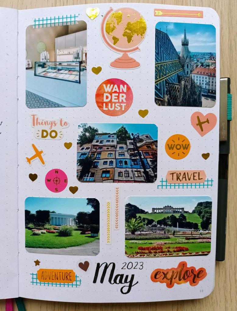
Photo credit: Laura Jones for Keeping It Creative

Monthly calendar

I’ve gone back to the slightly larger boxes for this month so I have plenty of room to record my university work, fitness classes and travel plans. Again, I’ve included mini photos of popular places in Vienna to visit and then filled in the spaces with more of the little stickers from by booklet. I didn’t really come up with a colour scheme but I wanted to go for different shades of blue to match with the bright blue skies in some of the photos.
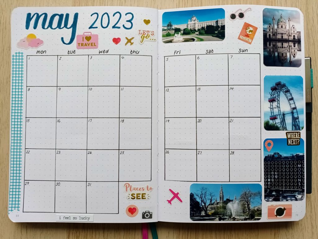
Photo credit: Laura Jones for Keeping It Creative

May finances

I’m sure we’ll be spending lots in May with all the bank holidays and our trip do I’ve made my expenses section a little bigger than last month. I decided to include a photograph of the amazing rooftop bar in our hotel as I reckon we’ll be spending time and money there relaxing with a cocktail or two!
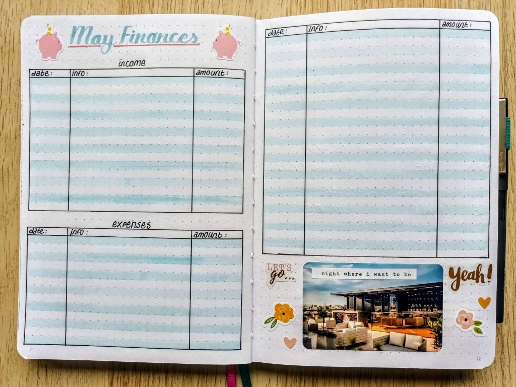
Photo credit: Laura Jones for Keeping It Creative

Travel information spreads

I want us to be super prepared for our trip as it helps to keep travel anxiety at bay. The booking information is all in various emails so I asked my husband to forward everything to me so I could add everything to my bullet journal. I understand why everything is done electronically now but I used to like paper copies so that I could stick things into my Traveller’s notebook as part of my scrapbooking.

So far, I’ve got our Manchester hotel booking information, the outbound and return flight details and our hotel booking information for Vienna. I’ve also written details of the train we can catch from airport and the stations we can alight at. I’ve pixelated the specifics for privacy reasons!
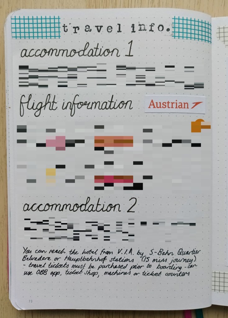
Photo credit: Laura Jones for Keeping It Creative

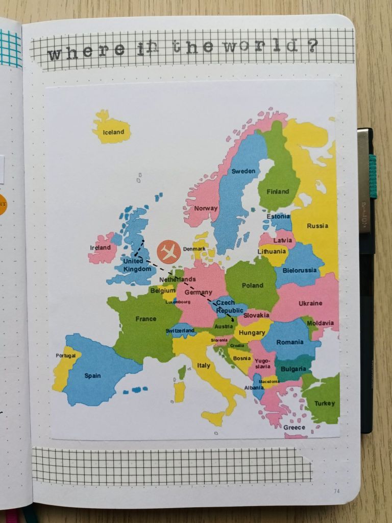
On the next page, I’ve included a map of Europe which shows Sunderland to Manchester (as the crow flies!) and the route from Manchester Airport to Vienna International Airport. It was also good to learn more about the countries which border Austria too. The ink I used for the stamping is Stazon which claims to allow you to use it on any surface so I tried it out on the top of one of my grid washis and it printed and dried really well.
Over the page, I’ve listed the must see and must visit places on a double page spread. This has helped me to create an itinerary for the first full day we are there.
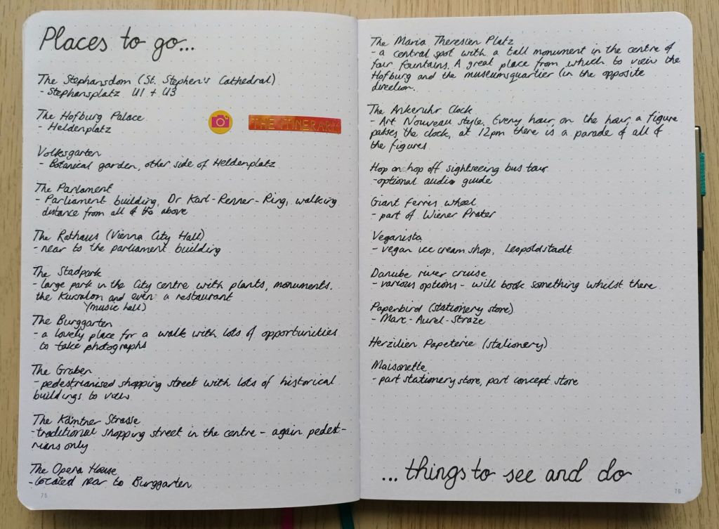
Photo credit: Laura Jones for Keeping It Creative

The next spread I have planned is a list of veggie / vegan cafes and restaurants which we might go to. I’ve tried looking at the menus for various places but most of them seem to be in German. I hope they have English menus as well as I can only speak / read about five words and none of them are food names.

My final travel spread will be my comprehensive packing list. I always do one of these no matter where we are headed and for how long as it ensures I remember everything and helps me to stay calm during the packing process. In the past, sorting everything out for a trip has made me really stressed out so I now do whatever I can to make the process easier and less fraught. Does anyone else find packing and organising for a holiday stressful?

Final words…

I hope you’ve enjoyed seeing my spreads for this month and that they’ve given you some ideas for travel planning and preparation. Obviously, for privacy reasons, I haven’t shown the exact dates for our trip or any specifics related to our journey or accommodation but I’m sure you get the idea and I may share my filled in pages on social media when we return.

Wishing you a wonderful May, whatever your plans are for the month,

Posted in art, bullet journal, Bullet journaling, creativity, Planning and journaling

Setting up my Bullet Journal for April 2023: Kite theme

Photo credit: Laura Jones for Keeping It Creative

This week, as my craft room is very chaotic due to my decluttering, I decided to bring my laptop downstairs and work at the dining table. This has given me the chance to open the patio doors on warmer days and listen to the birds in the garden. As well as it being milder, we’ve also had sun and rain creating rainbows and quite a few windy days. Just outside, we have a bright windmill stuck in a plant pot and it’s currently spinning round so fast the colours are merging! Although the wind here tends to be cold, at the moment, it’s not too bad – making me think that it’s perfect weather for kite flying. It’s this thought that gave me inspiration for my bullet journal theme for April. I’m excited to share my pages super early – it was certainly time consuming to create them so I hope you like them!

My cover page

Before designing my spreads, I like to have a look on Pinterest, YouTube and Google to see if my chosen theme has been done before. I found relatively few examples but my pages were inspired by the beautiful work of Claudia Joseph and her set up video. I’ve made it my own by choosing a different colour palette of primary and secondary colours, an alternative combination of art supplies and a number of pages which I know I’ll make use of next month.

I had the idea of creating a mixed media cover page with a pale watercolour wash and inked kites filled in with felt tip pens. For this, I decided to use my masking fluid on the kite shapes and then create a pale blue using cerulean blue and chinese white watercolour. Ask I hadn’t used masking fluid in my bullet journal before, I decided to test it out in the back of my notebook. I’m glad I did, as, although the watercolour itself looked good, the masking fluid pulled the coating off my page in several places and looked a mess. I also tried using my Tombows to colour in the kites and wasn’t happy with the results of that either!

In the end, I decided not to colour the background as sky and settled for ink and coloured pencils for the kites. I had used them in the past in my bullet journal to good effect with the only problem being colour transfer to the opposite page when completing later spreads. In an attempt to solve this, I popped to The Range and picked up a small can of Winsor & Newton Fixative to spray on my pages. This seems to have worked well and although it has an awfully strong chemical smell to it which permeates the air, I’m glad I purchased it.

Here’s the result using Staedtler Ergosoft Coloured Pencils, a Derwent colourless blending pencil, a 0.1 Pigma Micron (which broke on me halfway through but luckily I had a spare in my stash), a grey Zebra mildliner and the small tipped end of a Tombow dual pen for the writing.

Photo credit: Laura Jones for Keeping It Creative

To make sure my kites were neat and symmetrical, I folded a piece of thick paper and cut out designs in different sizes. I then drew around the stencils lightly in a 2H pencil. I’ve always used a HB to sketch out my designs but a 2H is much lighter – you just have to make sure you don’t press on too hard and it easily dents the paper (I’ve realised to my cost!).

My double page calendar page

I decided to try out a slightly different set up for my calendar boxes this month with individual 5×5 squares. I drew it up lightly in pencil first and then used the bullet pointed end of some of my Tombows. Creating the squares was made much easier by using a Helix metric squares template which I remembered I had as part of my supplies. I mostly love how the double page has turned out – it’s so bright and colourful and I think it will be a joy to see each day. The only thing that’s annoying me about it is that I pressed on a little too hard with the colouring in on front cover and it has dented the paper and caused it to be raised on the left hand side of the spread. I tried ironing it flat but it didn’t work as the paper has been stretched. Looking at it positively, I’ve certainly learnt something and hopefully I’ll remember this next time.

Photo credit: Laura Jones for Keeping It Creative

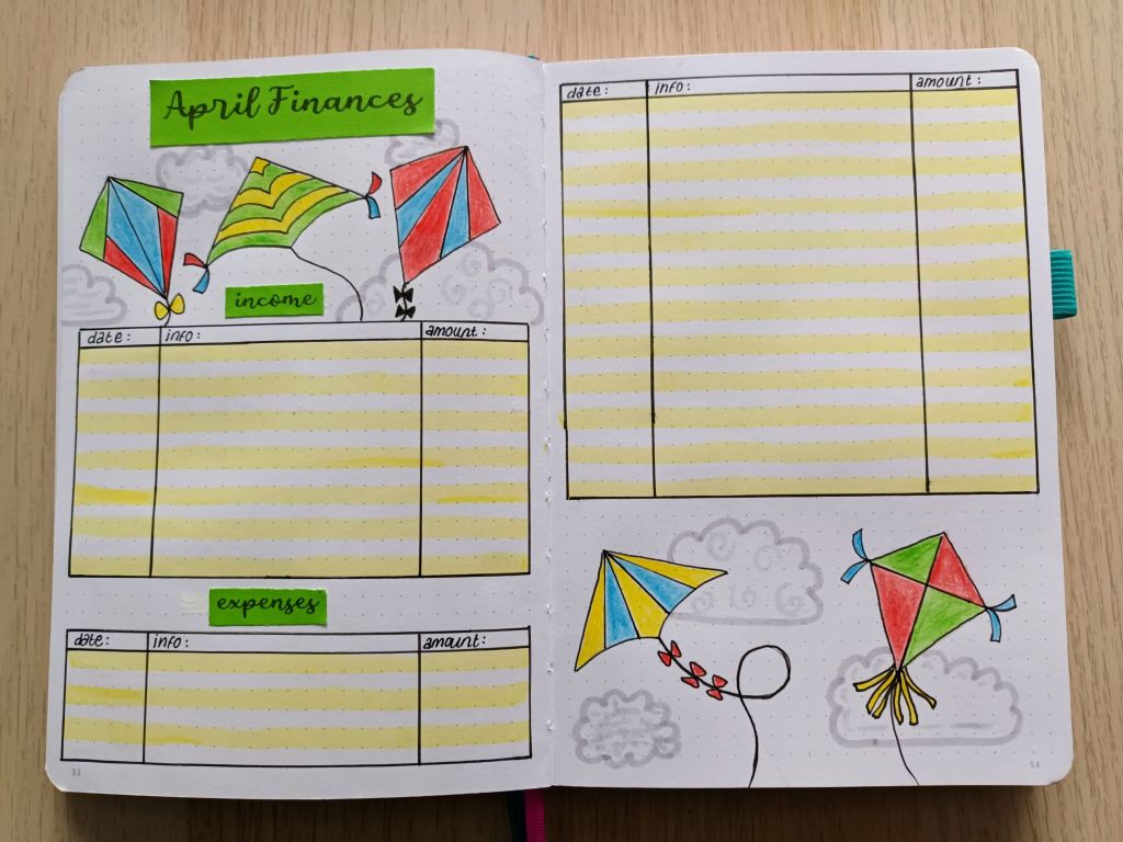
Finances for April

If you’re a regular here on my blog, you might notice that I’ve made the expenses section shorter for April. This is because I’ve had very little work at the university in March so my income will be a lot less. For this reason, I hope to have a low spend month. This has also meant that I had some space to do a little more decoration.

Photo credit: Laura Jones for Keeping It Creative

Final words…

Just like watercolour painting, drawing and colouring in is are great mindful and meditative activities and both provide a wonderful way to relax and de-stress. Although the pages for April were quite time consuming, it was nice to try something a little different and I like the way they’ve turned out. I might even use the bright coloured Tombows to draw out my weekly plan for the first full week of the month, rather than the usual fineliner.

I hope you’ve enjoyed seeing my spreads and I look forward to seeing the work of other bullet journalists on social media over the next week or so.

Wishing you all a wonderful April,

Posted in art, bird spotting, bullet journal, Bullet journaling, goal setting, lifestyle, Planning and journaling, watercolour painting

Setting up my Bullet Journal for March 2023: woodland songbirds theme

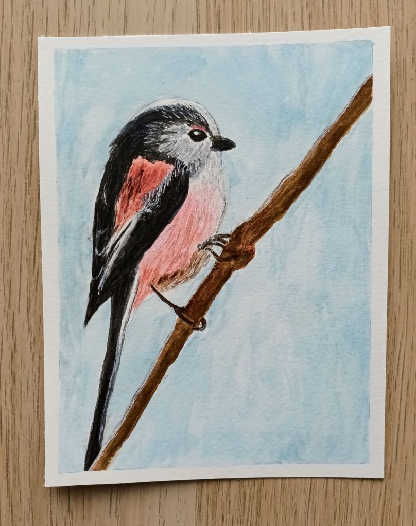
My idea for my March theme came from a walk my husband and I took at Rainton Meadows which is a stunning nature reserve situated in Houghton-Le-Spring in Sunderland. Whilst heading down the path next to one of the many ponds, we heard the unmistakable twittering of a group of long tailed tits. It was easy to spot them amongst the bare branches of a nearby tree and we stood watching them flitting around, presumably collecting tiny insects. As one of my favourite little woodland birds, I enjoyed observing their busy behaviour and I commented to my husband that I would love to have a go at drawing and painting one. When we got home, I searched for photographs of these cute birds and was excited to give it a go. I decided that if I was pleased with the result, I would incorporate my painting in my March set up. Needless to say, I’m over the moon with how my watercolour turned out so it became the image for my cover page.

Front cover

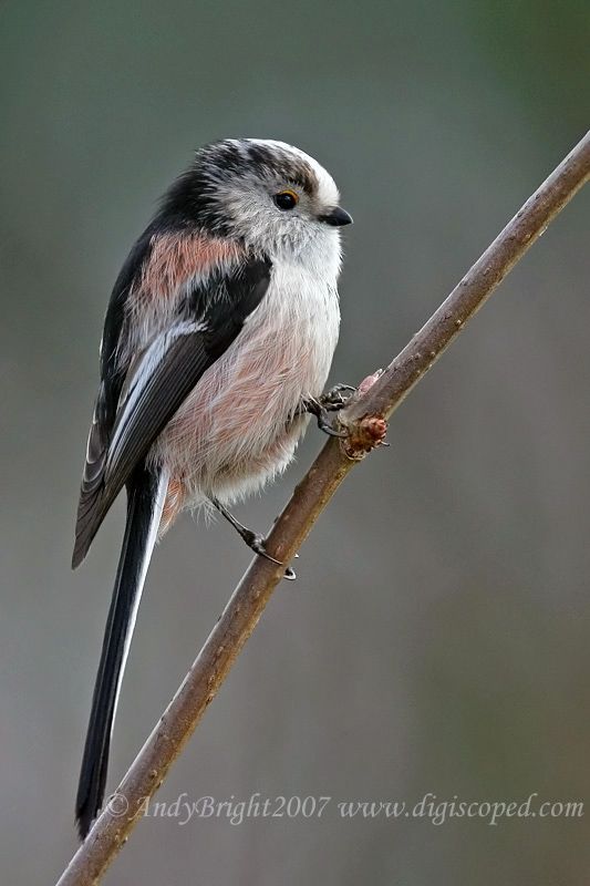
My painting was based on a reference image I found online (thanks for sharing Andy Bright) and the photograph features a long tailed tit gripping on to a single branch. I’m surprised the bird stayed still enough for such a stunning portrait as I’ve never managed to take a decent photo of this sweet but flighty bird!

For my art piece, I used a combination of Winsor & Newton Cotman watercolours, a cheap white gouache, a bright white Sakura gelly roll pen and a couple of coloured pencils to sharpen a few details. I worked on a small piece of Daler Rowney Aquafine smooth watercolour paper using the wet on dry technique. It took me a while to get the two pinky colours the way I wanted them but I’m developing my colour mixing skills as I experiment. Overall, it took me about three hours to complete my work and I think it was time well spent!

Original art work by Laura Jones

As the watercolour paper is very thick, I didn’t want to paste it directly into my bullet journal so I scanned it on my printer and printed it out. The results weren’t as good as I would have liked (my printer was relatively cheap), so I experimented a bit to see if I could get something that showed the colours in their true form. In the end, I printed the painting on a 4×6 inch glossy photograph paper which I could stick into my bullet journal. I’ve now got my painting underneath a large and heavy book hoping to flatten it out a bit as it’s started to curl!

Monthly Calendar

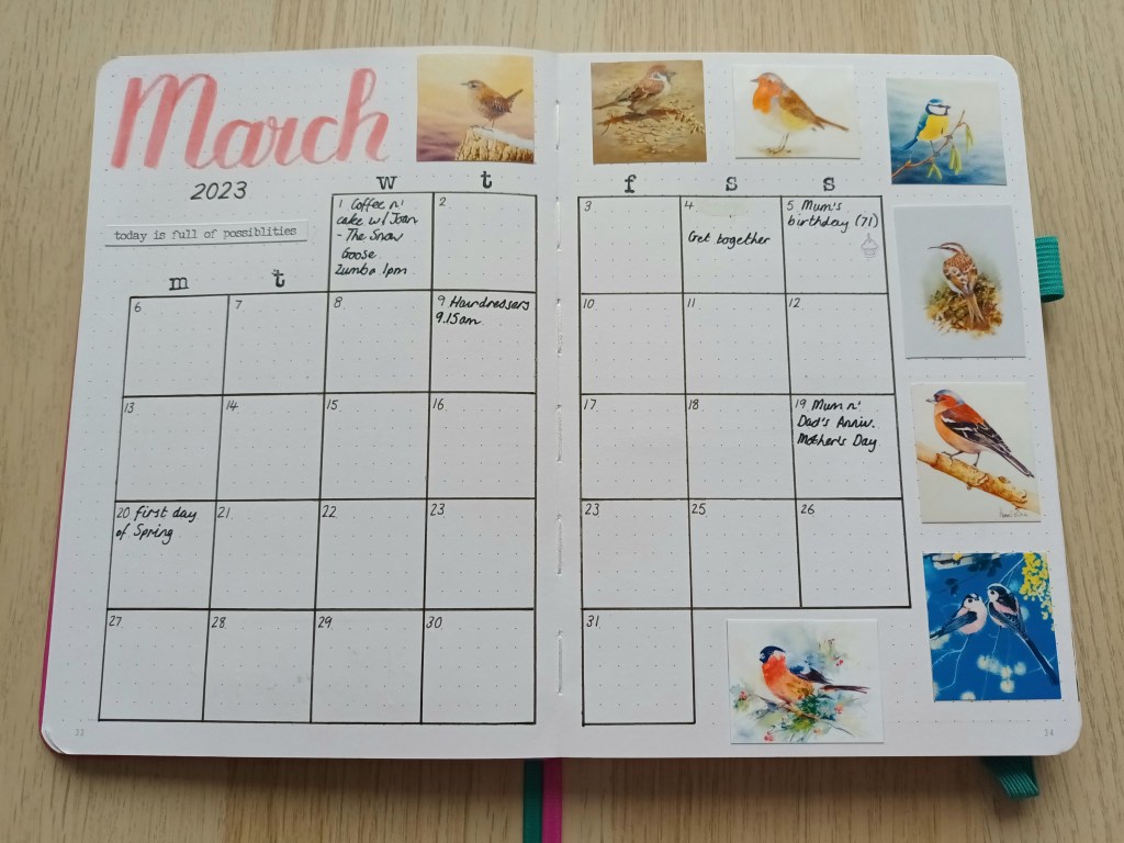
I wanted to continue with the woodland birds theme but knew that I would struggle to draw quick and simple birds and get my pages completed in good time, so I decided to search Google images for some watercolour paintings that I liked and then printed out mini versions on photo paper. I wish I could credit all of the original artists here but as I couldn’t always find them I will encourage my readers to search for the works online should they wish to find out who they were painted by.

Photo credit: Laura Jones for Keeping It Creative

Finances

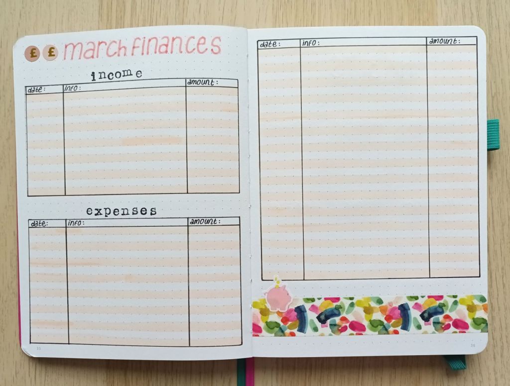
I’m still benefitting from keeping a record of my income and expenses so I’ve done another financial tracker this month. I also found some little piggy bank stickers in my stash so I decided to add one as decoration to go with some new watercolour washi I got from Amazon.

Photo credit: Laura Jones for Keeping It Creative

Habits trackers

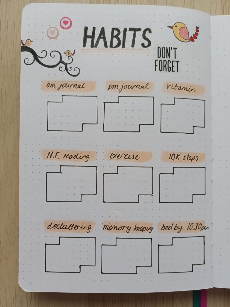
I’ve been tracking some of my habits as part of my rolling weekly but decided I want to keep a better record, so I created a whole spread for them. The plan is to add a dot or a cross each day I complete my habit. I knew I had some little bird stamps in my stamping supplies so I added these as some quick decoration.

Photo credit: Laura Jones for Keeping It Creative

Final words…

I hope you’ve enjoyed looking at my spreads for the month of March. I’m so pleased with how my watercolour painting turned out and I’m enjoying mixing different colours and trying out a range of techniques. I think I should also celebrate getting my pages done before the end of February, photographing and uploading my images as well as typing up a quick blog post to share them.

Wishing you all a wonderful March,

Posted in art, bullet journal, Bullet journaling, creativity, Gouache painting, Planning and journaling

Setting up my Bullet Journal for February 2023: Valentine’s Love Heart theme

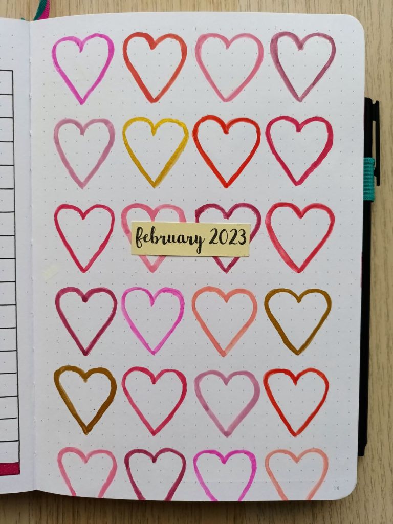
January seems to have flown by and we’re now into February. I’ve only just got my spreads for the month finished as I’ve been busy setting up my new STM notebook and have also had quite a few sessions at the university this year so far. I did a hearts theme before (back in Feb 2021) and I enjoyed using my watercolours to mixing various shades of red and pink so I thought I’d give it another go but this time I used gouache for a more opaque finish. The design for the front cover was inspired by a Caroline Gardner mirror compact that I got for Christmas which features heart outlines.

My pretty compact mirror from Caroline Gardner

The front cover

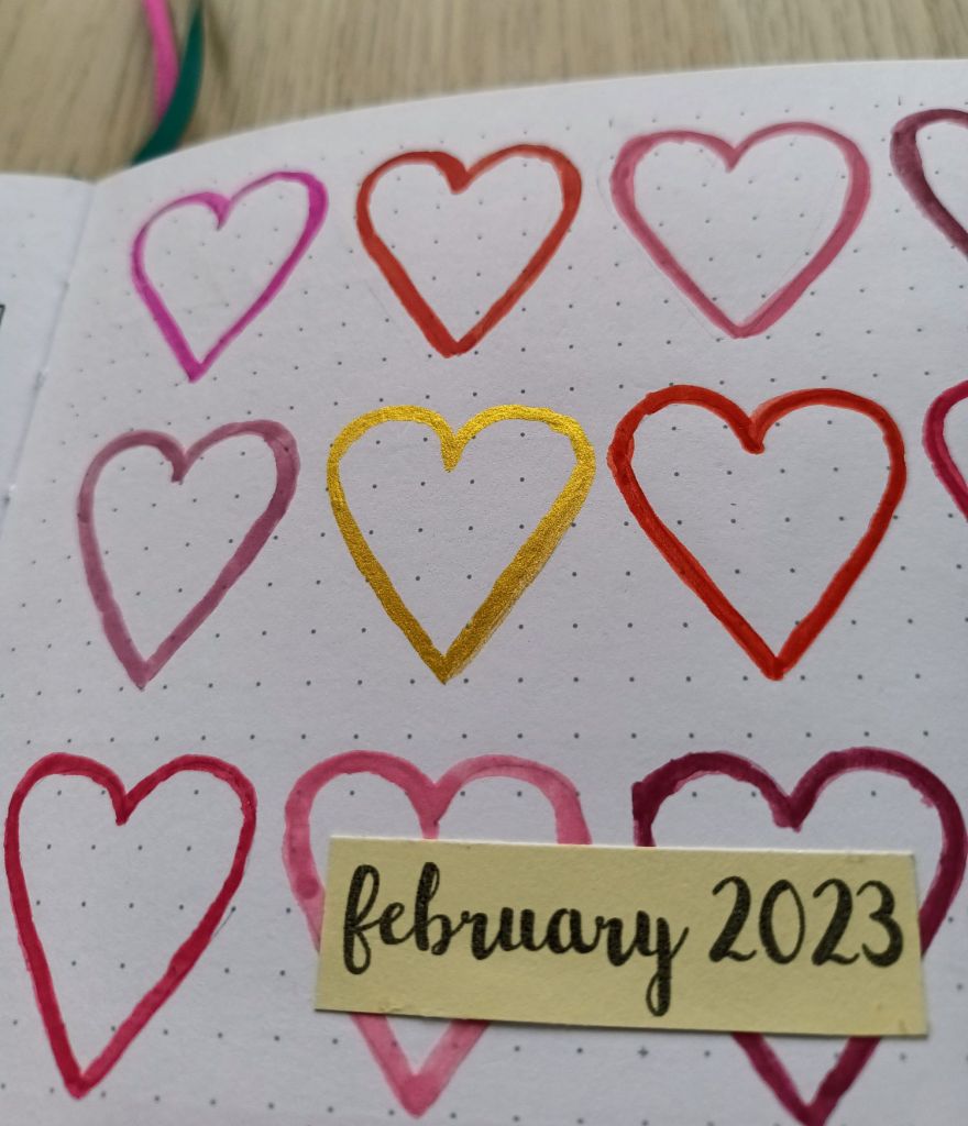
After practicing painting heart shapes in the back of my old bullet journal, I created a template and lightly sketched the outlines with a pencil. I then mixed a shade of pink and then used a number 2 round brush to paint a small number of hearts. I repeated the process with various reds and pinks and also added 3 gold hearts using my Finetec metallic watercolour paints. After leaving the paint to dry thoroughly, I created a small cream label for the month and the year using a gorgeous brush letter font which I recently downloaded called Northern Lights Script.

Photo credit: Laura Jones for Keeping It Creative

Calendar page

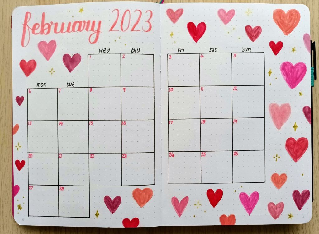
For the month on two pages calendar, I mixed similar colours and painted a range of filled hearts in different sizes. This time I used a size 0 round brush as the shapes were smaller. This time I very lightly hand sketched the heart shapes with a 2H pencil. When I’d finished, I realised that I hadn’t done any gold hearts so I decided to add some sparkle using a Uniball Signo gold gel pen creating dots, stars and curved diamond shapes.

Photo credit: Laura Jones for Keeping It Creative

Finances

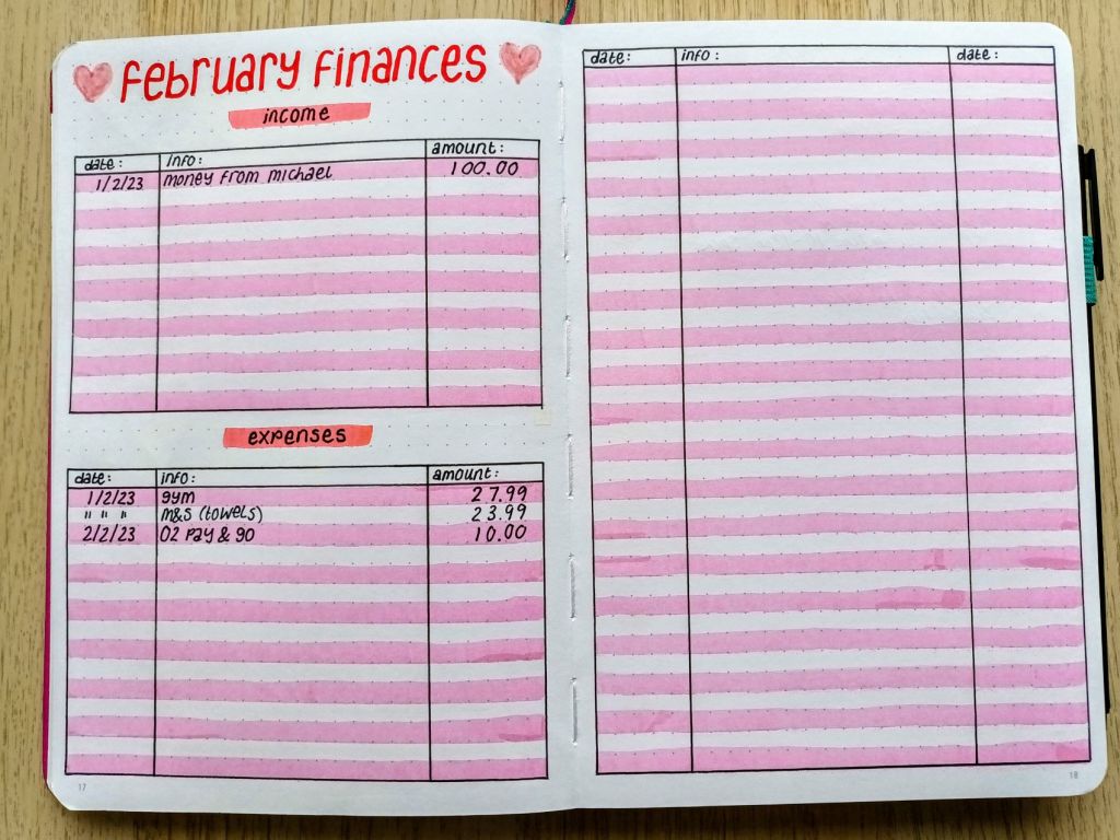
I’ve been enjoying using this format of financial tracker for a while now and I just change up the colours each month.

Photo credit: Laura Jones for Keeping It Creative

Weekly plan and rolling weekly

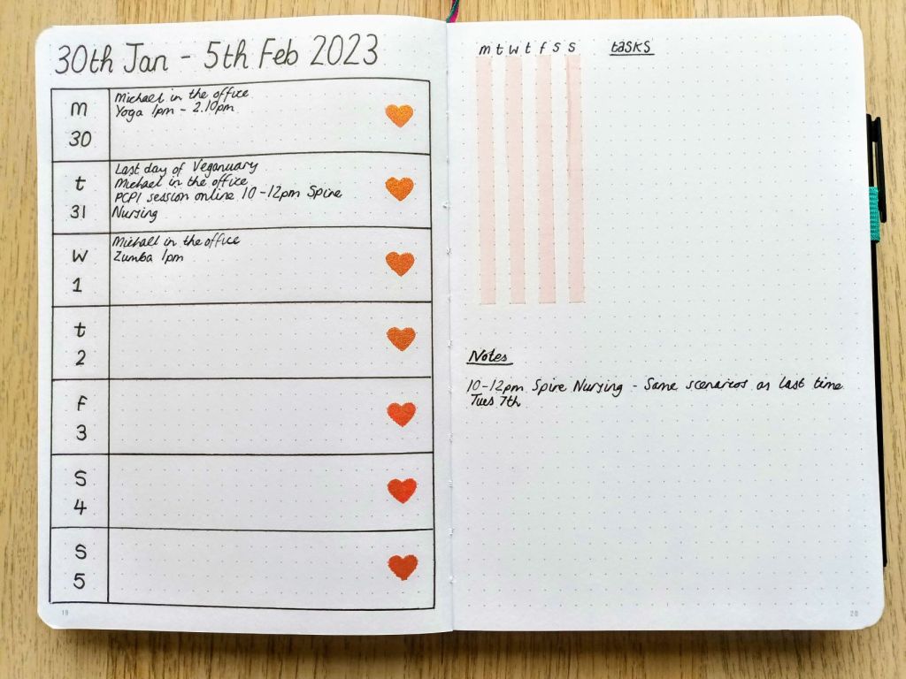
This is the first time I’ve done a week-on-one-page spread but now I do a rolling task list for the week I don’t need as much room as I’m only recording events, gym sessions and days out. The hearts for each day were inked using a heart outline (made using a punch), a gorgeous red/gold ink and a mini finger sponge. You can’t really see the iridescence in the photo but it looks really pretty when the hearts catch the light.

Photo credit: Laura Jones for Keeping It Creative

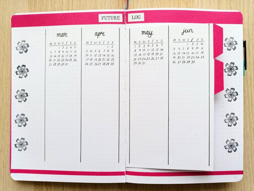
My future log for my new Bullet Journal

I created my future log for 12 months, starting in March 2023 and I’m really pleased with how simple and effective it is so I thought I would share here. It makes use of a Dutch door set up and I added little tabs for ease of use. Using a Dutch Door means that you create one title which can be seen from a number of pages.

Photo credit: Laura Jones for Keeping It Creative

Final words…

I’m really pleased with how my pages turned out and I hope you like them too. Doing some painting in your bullet journal is a super relaxing and mindful activity which I really enjoy. As long as your pages are a good weight and you don’t use too much water or add too many layers of paint there should be no bleed through or page wrinkling.

Wishing you all a wonderful February,

Posted in bullet journal, Bullet journaling, Planning and journaling

Moving in to a new bullet journal for February 2023: Scribbles That Matter notebook mini review

Earlier this month, I ordered a beautiful Notebook Therapy journal that has black linen covers and a falling star pattern to the front. Unfortunately, despite ordering over two weeks before February, it is yet to be dispatched. A few days ago, my husband suggested I should order a BuJo from the UK as I have just a few pages left in my current one. I did lots of research, and in the end, I went back to a brand which I have previously used, namely Scribbles That Matter. Since my last experience of using a STM journal, they’ve made some changes to their dot gridded notebooks so I thought I’d share the one I chose and discuss some improvements that have been made.

My new notebook in ‘Pink’ colourway with teal as a contrast

Ordering, delivery and packaging

I checked out both the STM website and the stock which they hold on Amazon, both offered free delivery but I decided that Amazon might dispatch slightly quicker, so I ordered from there. My notebook arrived within a few days and, due to minimal packaging, it fit through the letterbox (which was great as it arrived when we were both out).

As before, there were several choices of faux leather cover (AKA vegan leather), the iconic which has an embossed design and the plain pro version. Since I last ordered, they’ve also added other options such as a vintage version which it looked like they were selling off.

Over the years when I purchased STM notebooks, they seemed to often be changing the GSM (thickness and weight) of the paper to try to suit different customers needs. Now, I’m pleased to say, they offer 120gsm if you prefer thinner paper, and 160gsm if, like me, you like thicker paper with no bleed through and the ability to lightly use watercolours.

Various sizes of notebook are also offered including A5, B5, A6 and B6 but I have only ever order the A5 size. I’m pretty sure the quality would be the same but I noticed that the A6 and B6 are only available in the lower (and therefore thinner) GSM paper. The company also offer a large array of colours so there’s plenty of choice. However, I’ve come to like the little subtle motifs on the front of the Notebook Therapy branded journals so I shall miss that.

When I ordered a few years ago, STM were packaging their notebooks in ridged plastic and I believe a thin shrink wrap as well. Now, I’m pleased to say they come in a cardboard sleeve which I presume could be recycled. This is obviously much better for the environment.

The cover

I’ve always gone for the plain cover of the pro version of the notebook so I can only comment of the features of this one but I noticed that the only slight change is that it now says STM. at the bottom of the spine, whereas before it said SCRIBBLES THAT MATTER in the centre. This makes the branding much more discreet. The quality of the faux leather is still, in my opinion, great and, although it will probably get a few marks on it with use, this does not detract from the product. It’s also easy to wipe off any smudgy marks with soapy water.

The notebook stays closed with a vertical elastic band and there is a handy pen loop to the right hand side. A 0.4mm nib fineliner is included in the pen loop but I haven’t tested the quality of it yet. This size nib is new to me as I currently use 0.2, 0.3 and occasionally 0.5 Pigma Microns.

Interior design features

The notebook still has two ribbon bookmarks in colours which match the cover and elastic closure and as I’ve never had any of them become detached, they must be pretty secure (unlike my Notebook Therapy ones which have both come out this time!). There is again an expandable pocket to the reverse which I like to put stickers and receipts in, plus a sheet cut from the back so I can cut bits to cover larger mistakes.

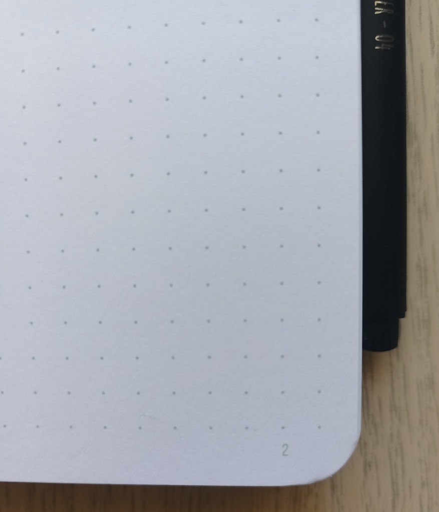
The page numbers are still small and subtle and I like the fact that the pages are numbered as this is not a feature of the NT journals. The dots go right up to the left and right of the page and are a subtle grey. There’s a slightly larger blank space at the top of the page and larger again at the bottom so the page number isn’t in the dot grid space.

5mm dot spacing with subtle page numbering

The paper is white in colour which I prefer to some other brands which have cream or off white pages. This is obviously just my personal preference but it is worth noting. STM say that there should be no ghosting or bleed through on the thicker GSM paper which suits my needs, but again you may prefer a thinner, lighter journal with thinner paper if neither of these issues bother you.

On the inside of the front cover, there’s a pre-printed bullet code page which is useful if you’re new to bullet journalling and need a hand reference. Or, if you want to change up your system. I’ve been using the same ones for years so I will probably cover it over with a motivational quote or something. Next is the name plate page with just has three relatively short lines on which you could write your full name and the date you started your notebook. There’s then a double page which is blank except for a footnote explaining the notebook style and size – A5 dotted and the paper thickness – 160 GSM. There are then 4 indexing grid pages with a blank space for you to write your own title. At the end of the book, there are two pen test pages, although one leaf is much thicker than the other so it’s not really a fair test to explore ghosting and bleed through. Personally, I would prefer the journal to be without these printed pages but they’re ideal for those who are new to bullet journal planning.

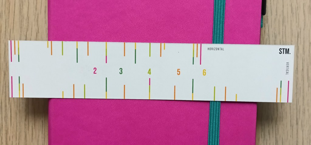
Inside the notebook is a little grid spacing ruler which is new. You can use it horizontally or vertically and it splits the page into 2, 3, 4, 5 and 6 using colour coded divisions. This will probably prove to be a useful addition which just fits in the back pocket.

Handy grid spacing ruler

Final words…

Overall, I’m really pleased with my new journal but I am disappointed that I had to source another notebook as I was looking forward to receiving my Notebook Therapy one. I have emailed them to enquire about what is taking so long but I received a standard reply advising that it may take up to three days for them to get back to me with a personal response. If you’re new to bullet journalling and looking for a quality, mid-price notebook which is made in the UK, then I totally recommend Scribbles That Matters. Any issues I had or questions have been responded to straightaway and I know they have a 100% satisfaction guarantee so that they continue to have very happy customers.

If you have any further questions about the A5 Pro Version journal, feel free to drop them in the comments and I will try my best to answer them.