Posted in art, watercolour painting

Creating a colour wheel using my watercolour paints and some tips for making your own

Photo credit: Laura Jones for Keeping It Creative

A few weeks ago, I decided to create a colour wheel using my Winsor & Newton Cotman watercolours to explore colour value and secondary and tertiary colours that could be made using the three primaries of red, yellow and blue. Although I already have ones of those little reference colour wheels that you can buy really cheaply on eBay of Amazon, it’s not made with actual paints so is of limited use. I really enjoyed the activity and the wheel will be a useful reference when I’m colour mixing and creating washes. It’s also good that it’s made with my actual paints as colours will be slightly different depending on the actual shades of the primary paint colour used e.g. lemon yellow will give different results to say cadmium yellow when mixed with cadmium red deep or a scarlet lake.

Drawing the colour wheel

My Helix circle drawing tool came in really handy for creating the wheel as I was able to draw the circles with it and also section them off using the angle measurer. I wanted to include primary, secondary and tertiary colours and also explore what happened when I lightened the colours by adding more water to the paint on my brush.

If you want to have a go at making one of this size using your own paints, the dimensions here are a circle the exact size of my Helix circle drawing tool (just over 14cm), 12 segments of 30 degrees each (360 degrees divided by the number of segments required) and two inner circles at 2.5cm in and 4.5cms in. My measurer was super helpful but you could also create one using a pair of compasses and a protractor.

Painting the primary colours

I began by painting the primary colours of red, yellow and blue. I started with the yellow segment as I read some advice that said you should always do the lighter colour first and finish with the darkest – makes total sense! To create a lighter colour value, I swished my brush in my water a little then took off some of the excess with paper towel before applying to the segment of the wheel. I then swished again to get an even light colour value.

Tip: before applying a lighter shade of the colour, dry off the segment a little in order to avoid colour bleeds.

N.B. In case you were wondering, colour value refers to the lightness of the colour.

Mixing the secondary colours

To mix the secondary colours, namely orange, green and purple (I called the purple segment violet because that’s what it said on the colour mixing wheel I purchased before), I used equal parts of two of the primary colours each time. So, red and yellow to make orange, blue and yellow to make green and red and blue to make purple (violet). I then repeated the swishing method to create lighter colour values.

Mixing the tertiary colours

Tertiary colours are those which are made by mixing equal parts of a primary colour with a secondary colour. These are then labelled with the name of the primary, followed by the name of the secondary e.g. yellow green, red orange etc. Again I mixed the colour with a little amount of water and then gradually diluted it.

Finishing off my colour wheel

I wanted to label the colours directly onto the paint but knowing that fineliner pens aren’t too good at writing over paint, I used my Dymo LetraTag on the smallest font, printing on transparent plastic tape. I think I probably wouldn’t have been able to write that small anyway!

Tip: Write the name of the paints you used on the back e.g. Winsor & Newton Cotman Watercolours, and the names of the three primary colours you used e.g. lemon yellow, cadmium red deep and cobalt blue hue so you don’t forget.

The finished result

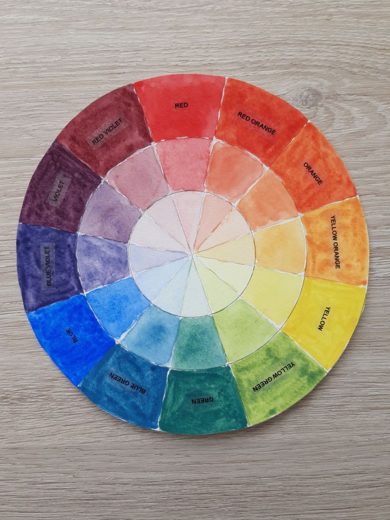
You could neaten your finished colour wheel by going over the pencil lines with a fineliner pen but I decided to leave my looking a little rough around the edges.

I hope this post has encouraged you to have a go at creating your own colour wheel. It took a while to do and I had a number of mixing palettes on the go at once but I think it’s well worth the effort. It’s also something I’d recommend doing for each of your sets of paint if you have more than one like I do as different brands tend to have slightly different colour compositions.

Posted in art, bullet journal, Bullet journaling, Planning and journaling, watercolour painting

Setting up my Bullet Journal for April: April showers theme

Hi everyone, hope you are all well and enjoying the warmer weather. This month, I’ve gone for an April showers theme featuring umbrellas and raindrops. Again, I had fun practising my drawing skills for the brollies and I also decided to get out my watercolours for the cover page using my Winsor & Newton Cotman paints for the large umbrella and my watercolour pencils for the tiny raindrops. I hope you enjoy looking at my spreads.

Cover page

For my cover page, I kept it simple with a single umbrella which I sketched in pencil onto hot pressed (smooth) watercolour paper and then inked using a Pigma micron pen in 02. I then wet some Cadmium Red deep straight out of the tube and used it for the top of the umbrella, applying the paint with a size 6 brush. After that had dried, I added a tiny amount of black to the mixture to create a darker contrasting hue for the underneath of the umbrella. By letting the first colour dry thoroughly, I avoided any colour bleeds when applying the darker colour. After leaving the umbrella to dry overnight to avoid any smudging, I drew the raindrops with the Pigma pen and then coloured them in with a dark blue watercolour pencil before using a small damp paintbrush (in size 0) to activate the paint. I was really careful not to lean on any of the wet paint as I didn’t want any issues like those I had with the calendar page as you will see next! The image was then scanned into my computer, pasted into a MS Publisher document and the month added.

Monthly calendar

For my calendar, I wrote April on dot grid paper and then cut it out to stick in as the header. The calendar is my usual six dots x six dots grid drawn with a 0.3 Pigma pen. The umbrellas are hand-drawn and coloured in with my watercolour pencils and then wetted to activate the paint. The raindrops were also done in the same way. As you can see, there are a few smudges, one from some Tombow ink and the other from accidentally dripping water on a couple of the raindrops. I’ve tried to cover them over with my white gel pen but I’m still not happy with it!

Photo credit: Laura Jones for Keeping It Creative

Another two double page Spring collage!

I enjoyed creating the other collages so much that I decided to do another one. Again, the photos are from Google Images. The paper backgrounds are from a paper pack I got from The Range and the hearts and flowers are cut with mini punches from Hobbycraft. Some stickers and ephemera completed the spreads nicely! The pages are such a joy to look at and I’m so pleased with how they turned out.

Photo credit: Laura Jones for Keeping It Creative

Yoga session tracker

This is where I record the session I followed on YouTube or the e-book sequence I followed. I also write in my yoga journal but I find writing in here gives me an at a glance record so I can be sure to have focused on stretching different parts of my body throughout the month. Again, I got smudges of Tombow elsewhere – the joys of being a leftie!

Photo credit: Laura Jones for Keeping It Creative

TBR and reading information spread

Again, I wanted to do a spread which shows the books I plan to read over the next couple of months. I also have an extra novel that I’m not going to get around to by the end of March too but I’d already done the spread so I shall read it in a few months time.

The benefits of reading fiction spider diagram was useful for reminding me about the benefits of reading for pleasure and also gave me the idea of writing this blog post. I’ve also done a bit of journalling about my reading and the books on my virtual TBR pile. I think it’s nice to include colour versions of the covers in my BuJo because, as I think I’ve said before, you don’t get to see them on the Paperwhite version of Kindle.

Photo credit: Laura Jones for Keeping It Creative

2 lines a day gratitude

A simple spread where I record at least three things a day for which I am grateful. I did this last month too and really enjoyed filling it in each evening.

That’s most of my spreads that I thought you might like to see this month. I have really got into using my bullet journal again now that my mental health has improved. I would love to know what theme you have chosen and, as usual, if you’ve shared your spreads on your blog, don’t forget to include a link so that other readers can have a nosey as well as me!

Happy bullet journalling!

Posted in art, creativity, lifestyle, mental health, Planning and journaling, watercolour painting

Currently… life update March 2021

I haven’t done one of these updates for a while (it was last March in fact!) so thought I might spend an hour or two composing one this afternoon. There have been quite a few changes since the last one so here goes:

Currently adjusting…

to a new mental health diagnosis. Yesterday, I had an appointment with the mental health team and psychiatrist to discuss issues that I had been having for an almost six month period. Basically, last year, I met with the team as I thought I had cyclothymic disorder which is a mild form of bipolar. However, it felt nothing like a mild illness, with me being very depressed since mid September 2021 and only getting better a few weeks ago. My appointment lasted two hours and it was really helpful as I had a long chat with a member of the team and then a video call with the psychiatrist who is working from home. I’ve now been diagnosed with Bipolar 2 and will be embarking on a completely new treatment plan which doesn’t involve anti-depressants – one of which I’ve been on for over 20 years! So now, I have a new condition to read up on and get my head around. Well, I say a new condition, but really I’ve had it for around 24 years and have only just been correctly diagnosed.

Currently buying…

nothing but the essentials. I have so many clothes, accessories and crafty bits and bobs that I really don’t need anything but food, drink and a few toiletries right now. In fact, I’m about to embark on a huge declutter of stuff as the wardrobe is fit to burst and my craft room has enough materials to last a lifetime and beyond.

Currently enjoying…

seeing glimpses of Spring. Things are starting to pop up in the garden, the birds are singing and the weather is starting to improve – today I went out without my coat on for the third time this year! Although I hate too much sunshine with having very fair skin, I love putting on my sunglasses and going out for relaxing walks or spending time in the garden. when the weather gets milder.

Currently learning…

all about productivity and organising stuff using a very popular method. Although I’ve not read the book, I’ve been able to use information from various infographics and YouTube videos to learn about the Getting Things Done Method by David Allen. I’m hoping to implement the main ideas shortly to help me get super organised and work efficiently throughout the week so I have the weekends totally free to spend time with my husband or on personal projects. If you want to learn the basics, I recommend you check out this YouTube channel as Emma provides a series of videos which talk you through GTD and shares real examples of how she follows the principles.

Currently making…

watercolour paintings to be used as designs for greetings cards. It all started when I couldn’t find a nice card for my dad for his birthday so I created a variegated watercolour wash using some of his favourite colours and then added some gold paint flecks to give it some sparkle. Then I started looking at tutorials on YouTube and Pinterest, had a go at some of them, and now I’m hooked on making my own unique cards. I even made my own envelopes using the We R Memory Keepers 1,2, 3 punch board!

Currently pinning…

a range of watercolour tutorials to give me ideas for cards and front cover designs for my monthly bullet journal set ups. I’m now using a Scribbles That Matter journal so the pages are nice and thick, although often I do the painting on hot pressed watercolour paper and then scan, print and stick it in. If you want to see some of my pins, you can check my Pinterest here.

So, that’s a mini update on me and my life currently. I hope you enjoyed reading about what I’m up to. I might do life updates more regularly in future, particularly if my new treatment plan for Bipolar 2 helps to keep me well. And if anyone reading has Bipolar disorder and writes about how it affects them in their blog, I would really love it if you dropped the link in the comments so I can check out your experiences and see if I can pick up any tips on managing the condition. Until next time, keep safe and well.

Posted in art, lifestyle, mental health, wellbeing

Monday Matters: The Wild Remedy – a book which explores the relationship between connection to nature and improved mental health

Today’s Monday Matters post is a little different in that it focuses on a book which I’ve recently started reading after hearing Chris Packham praising it on Springwatch last month. ‘The Wild Remedy – how nature mends us’ is the published diary of a naturalist, writer and illustrator called Emma Mitchell who has found herself better able to manage her mental health since she moved to live in the English Countryside and began to spend more time in nature.

Emma suffers from depression and finds that she particularly struggles in the winter months when the light is poor and the few colours to be seen outdoors are particularly drab. She describes her battle with Seasonal Affective Disorder and talks about how she has to force herself to interact with nature in any way she can in an attempt to lift her spirits. Her diary documents her highs and lows throughout the year and her experiences of the natural world in the different seasons. I have found her prose to be a complete joy to read and over the last few days I’ve devoured her writing and delighted in her photographs, drawings and watercolour work.

Whilst out on her walks, Emma absorbs herself in her surroundings and seeks out the beauty of flora and fauna and seasonal changes. She often collects wild flowers, leaves, berries and evidence of birds who have visit the area in the form of different feathers or pieces of eggshell. She also takes photographs of the scenery as evidence of the simple but wonderful sights of her visits to a range of natural environments. This immersion is a kind of mindful practise and one which helps her to become rejuvenated and happier.

When Emma returns home, she is able to study her finds and can search for them in one of her treasured wild flower books to learn more about a particular species. She also regularly makes photographic records so she is able to enjoy the beauty of these natural objects again and again. Emma is also a very creative person and she often produces detailed line sketches or small watercolour paintings which she finds very soothing for her mind. She includes her art work and photographs throughout her diary as a pictorial record of the nature calendar.

In the introduction to the book, the author describes a variety of research which has considered the effects of nature on the body and the mind. Walking in green spaces and observing natural landscapes has been shown to alleviate symptoms of anxiety and depression by causing a drop in the levels of cortisol (the stress hormone) in our bodies and releasing seretonin (the feel good chemical) into our brains. Also blood pressure decreases and pulse rates slow which has a positive effect on your physical and mental health.

Further discussion of recent scientific research shows numerous other ways that being in close contact with nature is good for our health. For example, many plant species produce compounds and oils known as phytoncides and when these are inhaled, they have a positive impact on our immune, hormonal, circulatory and nervous systems. We don’t have to actively go around sniffing different greenery either. Just been amongst trees and bushes regularly is enough to enjoy these health benefits. If you add in a good walk, especially in the sunshine, you will likely find your mood lifting due to raised seretonin levels and the release of feel good endorphins from the exercise.

I’ve read almost all of Emma’s book over the last few days and I’m looking forward the last few chapters. Her diary entries are beautifully written and you really feel as though you are there with her due to her delightful descriptions. Her field photographs and flat lay shots of her nature finds are so inspiring and are guaranteed to make you want to take out your camera to create some similar images.

A stunning two page spread of a range of wild flowers Emma collected on her walk

Emma is also an illustrator and an array of line drawings and hand painted watercolours are included throughout the pages. Although I couldn’t match her art work, I am keen to use my pencils, fineliners and paints to have a go at creating my own records of nature spotted within my back garden and whilst out on my walks.

Emma’s watercolour of a house sparrow which was a regular visitor to her garden feeding station

I’ve mentioned before the meditative and calming affects that drawing and painting can have and how this helps the body and the mind. Emma describes how the repetitive process of creating her nature images and not focusing too much on the results is as much of a boost for her as the walk itself.

I highly recommend ‘The Wild Remedy’ if you want to learn more about how nature can support good mental health or if, like me, you have a keen interest in the natural world. Although I find that I need medication to keep my depression and anxiety at bay and that regular talking therapies are required to help me learn strategies for managing my condition on a day-to-day basis, I think nature has so much to offer too and also plays its part in my mental wellbeing. I make sure I either go out for a walk in the park or local woodland each day or spending time tending to my garden and I encourage you to find the time to do the same.

Posted in art, bullet journal, creativity, Planning and journaling

Setting up my bullet journal for June: Summer fruits theme

This month I’ve gone for a bright and colourful Summer fruits theme and have included my own little fruit watercolour paintings which I scanned in and worked on using Photoshop on my computer and then turned them in to little stickers. I’ve not totally got to grips with all of the different things you can do on this program but I followed a great little tutorial which I’ll share below.

For my front cover, I created five different fruits, namely papaya, orange, kiwi, cherries and pineapple. I started by sketching them with pencil and then when I was happy with how they looked, I went over the outline and some details using a 0.2 UniPin fineliner. I then mixed colours from my Daler Rowney travel set and used a tiny brush to paint them. Each one is less than 4cm so I really took my time to ensure accuracy and it was a great mindful watercolouring activity. After scanning the paintings, I edited the background to make it white and removed some minor blemishes. Check out this great tutorial on YouTube for how to do this.

For my month at a glance I used the same kind of layout as usual with 6×6 dot boxes and again made my own stickers from some fruity artwork. I successfully covered up part of the date using some paper washi style stickers as I accidently wrote the beginning of the year as 200 instead of 2020. I did the spread late in the evening and think I was overly tired and that’s when I tend to make lots of mistakes. I also messed up on the next page too with is why I have a red paper background to the words ‘exercise tracker’.

As you can see, there’s a distinct lack of things happening in June due to the continuation of lockdown restrictions! My husband and I have started to go out to places but we tend to go on a whim rather than pre-planning.

I’m continuing to monitor my workouts in June and have just made a few small modifications and changed the colour scheme to fit with the Summer fruits theme. I’ve decided to make the steps tracker larger and have changed the scale on the graph to make it easier to fill in.

Finally, this month I’ve decided to make a record of the plants we’ve bought at the garden centre this year and include key information from each of the labels that came in the pots. I’ve also added a small drawing and coloured it in for each entry so that I’m also practising my drawing skills. The art work isn’t perfect but I’m getting better the more I give sketching a go. The layout of the spread is inspired by Emma at emusing-emma.blogspot.com who did something similar for her houseplants a few years ago in her bullet journal.

That’s all my spreads for this month. I have more plants to add to my record but won’t get them drawn until later on. If you would like to see more of my plant information, let me know and I’ll add them on to my BuJo set up for July.

Take care and stay safe everyone,