Posted in art, bullet journal, Bullet journaling, creativity, Planning and journaling

Setting up my Bullet Journal for April 2023: Kite theme

Photo credit: Laura Jones for Keeping It Creative

This week, as my craft room is very chaotic due to my decluttering, I decided to bring my laptop downstairs and work at the dining table. This has given me the chance to open the patio doors on warmer days and listen to the birds in the garden. As well as it being milder, we’ve also had sun and rain creating rainbows and quite a few windy days. Just outside, we have a bright windmill stuck in a plant pot and it’s currently spinning round so fast the colours are merging! Although the wind here tends to be cold, at the moment, it’s not too bad – making me think that it’s perfect weather for kite flying. It’s this thought that gave me inspiration for my bullet journal theme for April. I’m excited to share my pages super early – it was certainly time consuming to create them so I hope you like them!
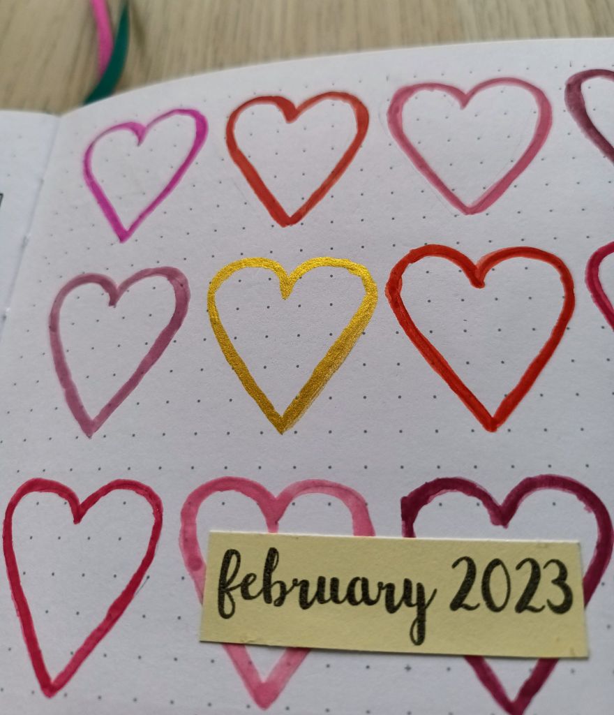
My cover page

Before designing my spreads, I like to have a look on Pinterest, YouTube and Google to see if my chosen theme has been done before. I found relatively few examples but my pages were inspired by the beautiful work of Claudia Joseph and her set up video. I’ve made it my own by choosing a different colour palette of primary and secondary colours, an alternative combination of art supplies and a number of pages which I know I’ll make use of next month.

I had the idea of creating a mixed media cover page with a pale watercolour wash and inked kites filled in with felt tip pens. For this, I decided to use my masking fluid on the kite shapes and then create a pale blue using cerulean blue and chinese white watercolour. Ask I hadn’t used masking fluid in my bullet journal before, I decided to test it out in the back of my notebook. I’m glad I did, as, although the watercolour itself looked good, the masking fluid pulled the coating off my page in several places and looked a mess. I also tried using my Tombows to colour in the kites and wasn’t happy with the results of that either!

In the end, I decided not to colour the background as sky and settled for ink and coloured pencils for the kites. I had used them in the past in my bullet journal to good effect with the only problem being colour transfer to the opposite page when completing later spreads. In an attempt to solve this, I popped to The Range and picked up a small can of Winsor & Newton Fixative to spray on my pages. This seems to have worked well and although it has an awfully strong chemical smell to it which permeates the air, I’m glad I purchased it.

Here’s the result using Staedtler Ergosoft Coloured Pencils, a Derwent colourless blending pencil, a 0.1 Pigma Micron (which broke on me halfway through but luckily I had a spare in my stash), a grey Zebra mildliner and the small tipped end of a Tombow dual pen for the writing.

Photo credit: Laura Jones for Keeping It Creative

To make sure my kites were neat and symmetrical, I folded a piece of thick paper and cut out designs in different sizes. I then drew around the stencils lightly in a 2H pencil. I’ve always used a HB to sketch out my designs but a 2H is much lighter – you just have to make sure you don’t press on too hard and it easily dents the paper (I’ve realised to my cost!).

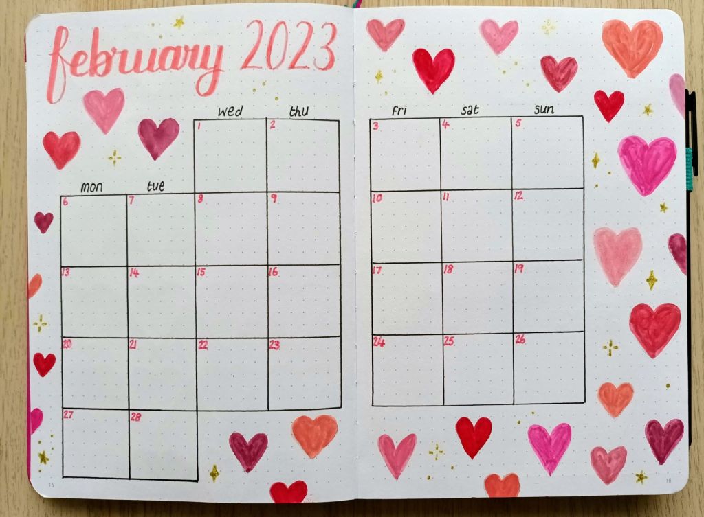
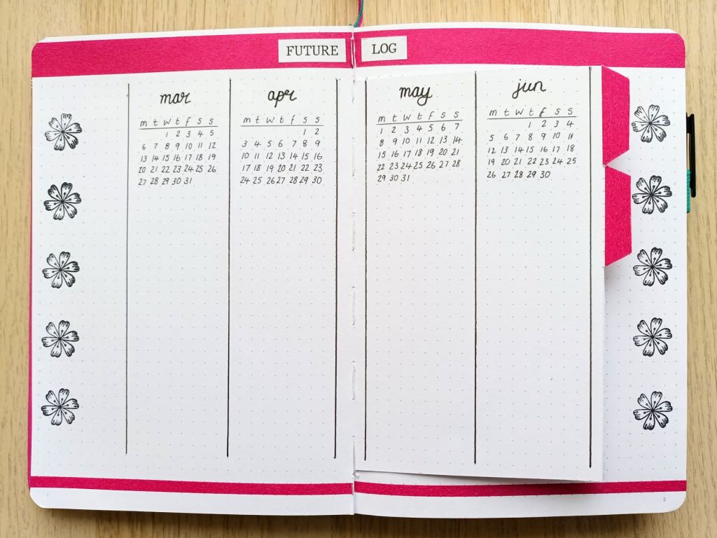
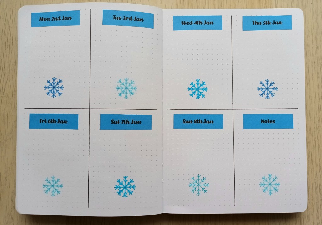
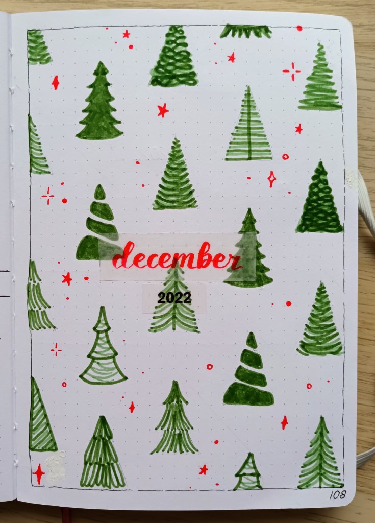
My double page calendar page

I decided to try out a slightly different set up for my calendar boxes this month with individual 5×5 squares. I drew it up lightly in pencil first and then used the bullet pointed end of some of my Tombows. Creating the squares was made much easier by using a Helix metric squares template which I remembered I had as part of my supplies. I mostly love how the double page has turned out – it’s so bright and colourful and I think it will be a joy to see each day. The only thing that’s annoying me about it is that I pressed on a little too hard with the colouring in on front cover and it has dented the paper and caused it to be raised on the left hand side of the spread. I tried ironing it flat but it didn’t work as the paper has been stretched. Looking at it positively, I’ve certainly learnt something and hopefully I’ll remember this next time.
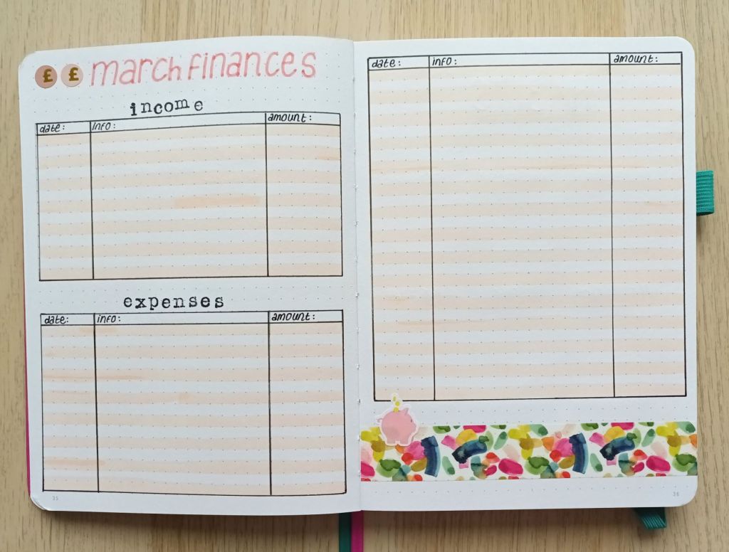
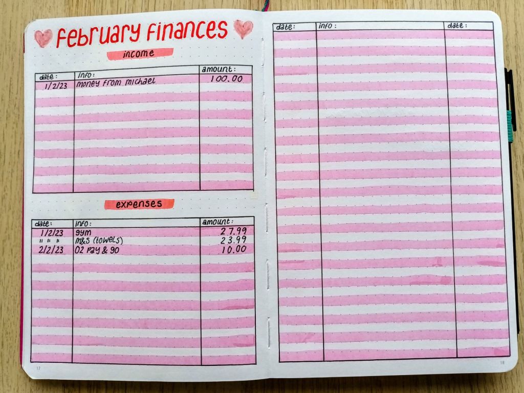
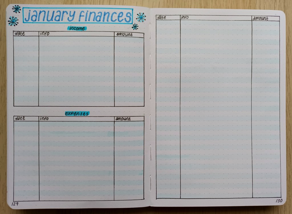
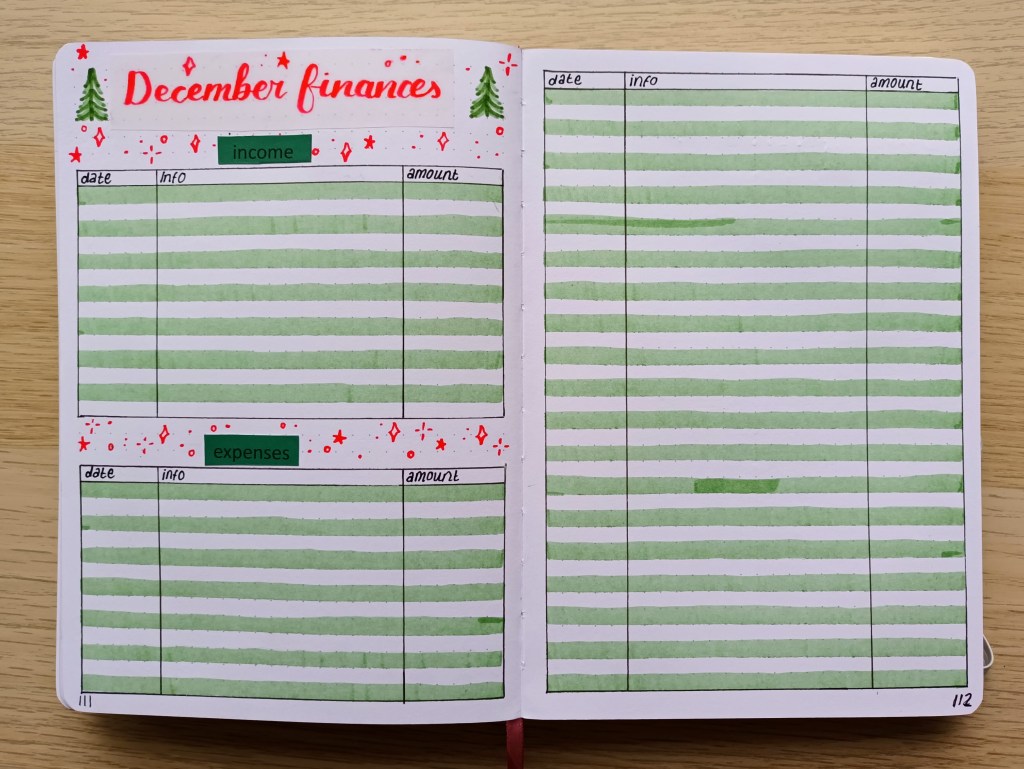
Photo credit: Laura Jones for Keeping It Creative

Finances for April

If you’re a regular here on my blog, you might notice that I’ve made the expenses section shorter for April. This is because I’ve had very little work at the university in March so my income will be a lot less. For this reason, I hope to have a low spend month. This has also meant that I had some space to do a little more decoration.

Photo credit: Laura Jones for Keeping It Creative

Final words…

Just like watercolour painting, drawing and colouring in is are great mindful and meditative activities and both provide a wonderful way to relax and de-stress. Although the pages for April were quite time consuming, it was nice to try something a little different and I like the way they’ve turned out. I might even use the bright coloured Tombows to draw out my weekly plan for the first full week of the month, rather than the usual fineliner.

I hope you’ve enjoyed seeing my spreads and I look forward to seeing the work of other bullet journalists on social media over the next week or so.

Wishing you all a wonderful April,

Posted in art, bird spotting, bullet journal, Bullet journaling, goal setting, lifestyle, Planning and journaling, watercolour painting

Setting up my Bullet Journal for March 2023: woodland songbirds theme

My idea for my March theme came from a walk my husband and I took at Rainton Meadows which is a stunning nature reserve situated in Houghton-Le-Spring in Sunderland. Whilst heading down the path next to one of the many ponds, we heard the unmistakable twittering of a group of long tailed tits. It was easy to spot them amongst the bare branches of a nearby tree and we stood watching them flitting around, presumably collecting tiny insects. As one of my favourite little woodland birds, I enjoyed observing their busy behaviour and I commented to my husband that I would love to have a go at drawing and painting one. When we got home, I searched for photographs of these cute birds and was excited to give it a go. I decided that if I was pleased with the result, I would incorporate my painting in my March set up. Needless to say, I’m over the moon with how my watercolour turned out so it became the image for my cover page.

Front cover

My painting was based on a reference image I found online (thanks for sharing Andy Bright) and the photograph features a long tailed tit gripping on to a single branch. I’m surprised the bird stayed still enough for such a stunning portrait as I’ve never managed to take a decent photo of this sweet but flighty bird!

For my art piece, I used a combination of Winsor & Newton Cotman watercolours, a cheap white gouache, a bright white Sakura gelly roll pen and a couple of coloured pencils to sharpen a few details. I worked on a small piece of Daler Rowney Aquafine smooth watercolour paper using the wet on dry technique. It took me a while to get the two pinky colours the way I wanted them but I’m developing my colour mixing skills as I experiment. Overall, it took me about three hours to complete my work and I think it was time well spent!

Original art work by Laura Jones

As the watercolour paper is very thick, I didn’t want to paste it directly into my bullet journal so I scanned it on my printer and printed it out. The results weren’t as good as I would have liked (my printer was relatively cheap), so I experimented a bit to see if I could get something that showed the colours in their true form. In the end, I printed the painting on a 4×6 inch glossy photograph paper which I could stick into my bullet journal. I’ve now got my painting underneath a large and heavy book hoping to flatten it out a bit as it’s started to curl!

Monthly Calendar

I wanted to continue with the woodland birds theme but knew that I would struggle to draw quick and simple birds and get my pages completed in good time, so I decided to search Google images for some watercolour paintings that I liked and then printed out mini versions on photo paper. I wish I could credit all of the original artists here but as I couldn’t always find them I will encourage my readers to search for the works online should they wish to find out who they were painted by.

Photo credit: Laura Jones for Keeping It Creative

Finances

I’m still benefitting from keeping a record of my income and expenses so I’ve done another financial tracker this month. I also found some little piggy bank stickers in my stash so I decided to add one as decoration to go with some new watercolour washi I got from Amazon.

Photo credit: Laura Jones for Keeping It Creative

Habits trackers

I’ve been tracking some of my habits as part of my rolling weekly but decided I want to keep a better record, so I created a whole spread for them. The plan is to add a dot or a cross each day I complete my habit. I knew I had some little bird stamps in my stamping supplies so I added these as some quick decoration.

Photo credit: Laura Jones for Keeping It Creative

Final words…

I hope you’ve enjoyed looking at my spreads for the month of March. I’m so pleased with how my watercolour painting turned out and I’m enjoying mixing different colours and trying out a range of techniques. I think I should also celebrate getting my pages done before the end of February, photographing and uploading my images as well as typing up a quick blog post to share them.

Wishing you all a wonderful March,

Posted in art, bullet journal, Bullet journaling, creativity, Gouache painting, Planning and journaling

Setting up my Bullet Journal for February 2023: Valentine’s Love Heart theme

January seems to have flown by and we’re now into February. I’ve only just got my spreads for the month finished as I’ve been busy setting up my new STM notebook and have also had quite a few sessions at the university this year so far. I did a hearts theme before (back in Feb 2021) and I enjoyed using my watercolours to mixing various shades of red and pink so I thought I’d give it another go but this time I used gouache for a more opaque finish. The design for the front cover was inspired by a Caroline Gardner mirror compact that I got for Christmas which features heart outlines.

My pretty compact mirror from Caroline Gardner

The front cover

After practicing painting heart shapes in the back of my old bullet journal, I created a template and lightly sketched the outlines with a pencil. I then mixed a shade of pink and then used a number 2 round brush to paint a small number of hearts. I repeated the process with various reds and pinks and also added 3 gold hearts using my Finetec metallic watercolour paints. After leaving the paint to dry thoroughly, I created a small cream label for the month and the year using a gorgeous brush letter font which I recently downloaded called Northern Lights Script.

Photo credit: Laura Jones for Keeping It Creative

Calendar page

For the month on two pages calendar, I mixed similar colours and painted a range of filled hearts in different sizes. This time I used a size 0 round brush as the shapes were smaller. This time I very lightly hand sketched the heart shapes with a 2H pencil. When I’d finished, I realised that I hadn’t done any gold hearts so I decided to add some sparkle using a Uniball Signo gold gel pen creating dots, stars and curved diamond shapes.

Photo credit: Laura Jones for Keeping It Creative

Finances

I’ve been enjoying using this format of financial tracker for a while now and I just change up the colours each month.

Photo credit: Laura Jones for Keeping It Creative

Weekly plan and rolling weekly

This is the first time I’ve done a week-on-one-page spread but now I do a rolling task list for the week I don’t need as much room as I’m only recording events, gym sessions and days out. The hearts for each day were inked using a heart outline (made using a punch), a gorgeous red/gold ink and a mini finger sponge. You can’t really see the iridescence in the photo but it looks really pretty when the hearts catch the light.

Photo credit: Laura Jones for Keeping It Creative

My future log for my new Bullet Journal

I created my future log for 12 months, starting in March 2023 and I’m really pleased with how simple and effective it is so I thought I would share here. It makes use of a Dutch door set up and I added little tabs for ease of use. Using a Dutch Door means that you create one title which can be seen from a number of pages.

Photo credit: Laura Jones for Keeping It Creative

Final words…

I’m really pleased with how my pages turned out and I hope you like them too. Doing some painting in your bullet journal is a super relaxing and mindful activity which I really enjoy. As long as your pages are a good weight and you don’t use too much water or add too many layers of paint there should be no bleed through or page wrinkling.

Wishing you all a wonderful February,

Posted in art, bullet journal, Bullet journaling, creativity, Mindfulness, Planning and journaling

Setting up my Bullet Journal for January 2023: Winter snowflakes theme

Happy New Year to all of my readers! Wishing you a fantastic 2023. I’m a bit late sharing my bullet journal pages this time as I only just got them finished. I’ve done a snowflakes theme before, but last time, I did a monochrome version with just my Pigma micron pens. I ordered some new brush and fine nib pens to arrive just after Christmas and there are lots of lovely blues in the set of 24, so I thought I’d try out the fine tips on my January spreads. I hope you like them and as always, if you’ve shared your pages for this month, feel free to link them in the comments.

Cover page

This month’s cover page is heavily influenced by a design from @createmore.se on Instagram. I’ve changed it up slightly by adding sparkles, dots and small circles but the composition is mainly the same. I used my circle drawing tool and, as I messed up the lettering in my notebook, I cut a page from the back using my X-Acto knife, trimmed it down, created the wreath and then stuck it in after I’d finished. I decided to do a rough freehand border around it to make it stand out. My new pens are from the Ohuhu brand and I ordered the mid tone range which has some lovely pastel colours.

Photo credit: Laura Jones for Keeping It Creative

Monthly Calendar

I’m really pleased with how this one turned out. It’s my usual grid layout with different snowflake designs filling the space. It took me a while but it was a nice bit of mindful drawing in the evening of the first of January,

Photo credit: Laura Jones for Keeping It Creative

Finances

Again, this spread is self explanatory. By the end of last month, my expenses table was completely full – in fact I ran out of space! Hopefully, this month will be a lot lighter on the spending front!

Photo credit: Laura Jones for Keeping It Creative

TV series watched

I don’t do one of these each month but my last one ran up until the end of December so I’ve just set up a new one. I like to record all of the different series we watch and the particular genres we enjoy. It’s nice to see all of the things we’ve watched and is a good reminder of what we’ve seen.

Photo credit: Laura Jones for Keeping It Creative

Veganuary Week 1 Meal Planning

My husband and I are doing Veganuary again this year which means we’re eating vegan for the whole of January. It gets easier every year but we still need to do a meal plan each week so that we know what we’re having for lunch and dinner each day. I also find the meal planning pages from previous years really useful. Obviously, this page could be useful whatever your diet but we don’t tend to spend long thinking of meal ideas the rest of the year.

Photo credit: Laura Jones for Keeping It Creative

Weekly Plan

This is my first weekly of the month. I used the same snowflake design for each day because coming up with different designs is what took a lot of time for the cover and calendar. I messed up on the spacing for this spread so the bottom columns are one dot space shorter than the ones at the top but it doesn’t bother me too much as I tend to write less at the weekends anyway.

Photo credit: Laura Jones for Keeping It Creative

Final words…

That’s all of the spreads I’ve drawn up so far. I have my running task list to set up this morning which will go on the page after my weekly plan and I will of course be doing more meal planning spreads and weekly plans over the weeks. I hope you’ve enjoyed looking at my spreads for this month. We have no snow here at the moment but it is certainly cold enough to get some white stuff soon.

Posted in art, bullet journal, Bullet journaling, Hand lettering, Planning and journaling

Setting up my Bullet Journal for December 2022: Christmas trees theme

Last month, I decided really early on that I wanted to do a Christmas trees theme for December. I was debating doing a watercolour scene featuring real trees and snow for the front cover but knew this would be quite time consuming as I would have to find tutorial to help me and then I would have to paint all of the other trees throughout the month for a cohesive look. However, in the last few days of November, I took to YouTube, searching the videos for inspiration and found this fairly easy but pretty set up from Claire Marie Bee which I was excited to recreate and make my own. I’ve copied quite a few of her ideas and, although it took quite a while to sketch out the tree pattern it was simple enough to do and I love the result.

Front cover

I started the process of creating the front cover by sketching the outlines of the trees in a diagonal pattern. I then turned to the back of my bujo and spent some time practising different designs. The inspiration for the trees was taking from Claire’s video and also from images I found by typing in ‘tree doodles’ into Google. I used just two colours of Tombow ABT for the colouring – dark olive 158 and asparagus 192 and a red Pentel sign brush pen for the sparkles. The page was then outlined using a 0.,1 micron. I also used Claire’s idea of writing the word December on vellum and this meant I could practise a few times and pick the best one!

Photo credit: Laura Jones for Keeping It Creative Blog

The monthly calendar

This is my usual 6×6 box calendar with trees dotted about in the background. I didn’t create a pattern with these two pages – I just chose some designs and placed them where I felt they would look good. Again, I wrote December on vellum, this time using a Tombow brush pen in poppy red 856. The Pentel pen and the red Tombow are very similar in colour and I don’t mind that they’re not a perfect match.

Photo credit: Laura Jones for Keeping It Creative Blog

Finances

These pages are the same layout as I’ve been using for a while now. Again, I added a title using the Pentel sign brush pen. The words income and expenses are printed on green paper and stuck on because I messed up the writing on them first time. I wish the words were central on the page, but I guess I’ll just have to put up with it!

Photo credit: Laura Jones for Keeping It Creative Blog

Final words…

I hope you’ve enjoyed looking at my spreads for December. If you like finding time to do something creative each week, I really recommend having a go at doing some tree doodles. My sketches are 2cms wide by 3cms tall, but you can make them any size you want. Sitting down and quietly drawing is a wonderfully mindful activity and a great way to destress during the very busy month of December.