At the beginning of the month, I started a ceramics for beginners class. Working with clay is something I’ve been wanting to try for a while and I was so excited to find a fully funded course where I could develop the basic skills, have fun working on some exciting projects and meet some lovely people who enjoy getting creative.
Following on from week one which was our enrolment, paperwork and getting to know you session, we spent the second session learning the skills involved in creating a pinch pot, making spirals and using a press to form tiles. This week, we actually got to make a finished product that we could put in the kiln and then glaze. I decided to try my hand at making a small plant pot to put a potted succulent inside.
In order to make a nice and even pot, I decided to create a circular base and build up coils around the circumference. The previous week we’d learnt the score and slip technique which is used to join pieces of clay together. Click here to see a great tutorial I found online which shows this technique in action to make a simple clay pot.
The photograph below shows the circular piece which I created with a pastry cutter and the first rolled length of clay for the sides. After making these pieces, I then score lines around the edge of the base and along the thin roll of clay for my first layer. After the scoring, you dip your clay covered fingers in water and wet both pieces. The two pieces of clay are then pushed together. This creates a good join.

After making and adding each coil of clay, I blended them in to the base using my fingers to create smooth sides. This took me a long time but I was determined to get a good looking pot by the end of the three hour lesson!


By the time I’d made four thin sausages of clay of the same width, scored and slipped each and blended them, I’d had enough of that technique and decided it was time to have some fun with adding texture. used a jewelled strip, wrapped it around gently pressed it in. I repeated this several times until I was happy with the effect.
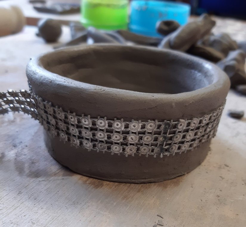
Finally, I created further texture around rim of the pot using a piece of metal dowel to make small dimples and added a trio of little feet (which I made prior to constructing the pot) to the design.
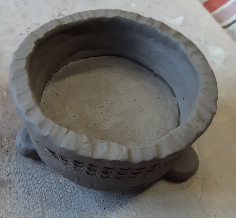
And here’s my finished pot, ready to be left to air dry before going in the kiln. I’m quite pleased with the results as it’s the first pot I’ve ever made. I’m looking forward to glazing it in a few week’s time and just need to decide on a colour.
Have you ever had a go at making anything with clay? If so, what did you make and did you enjoy it? I found it to be a wonderful and relaxing experience. I only used half of the clay that I was given for the session so the tutor wrapped some up in cling film for me to use at home. I’ve just ordered some modelling tools and I have plenty mark making craft materials in my stash to experiment with.
I hope you’ve enjoyed reading about my ceramic pot making experiences. Watch this space to see how it looks when it’s been glazed and re-fired. Hopefully I’ll be able to find the perfect potted succulent that fits inside.