
This June, I’ve gone for something completely different for my monthly BuJo decor. Usually, in the Summer months, I opt for bright colours and seasonal things such as fruits, butterflies, ice cream and beach holidays. However, this time, I took inspiration from our recent trip to The Algarve in Portugal and decided on a Portuguese ceramic tiles theme. Although a range of colours appear in these traditional items, the most popular by far is dark blue on a white background. The designs can be incredibly intricate but I opted for simple patterns as I really wanted to add cute swallows somewhere in my theme but at the same time, ensure I hadn’t set myself too much of a drawing challenge!
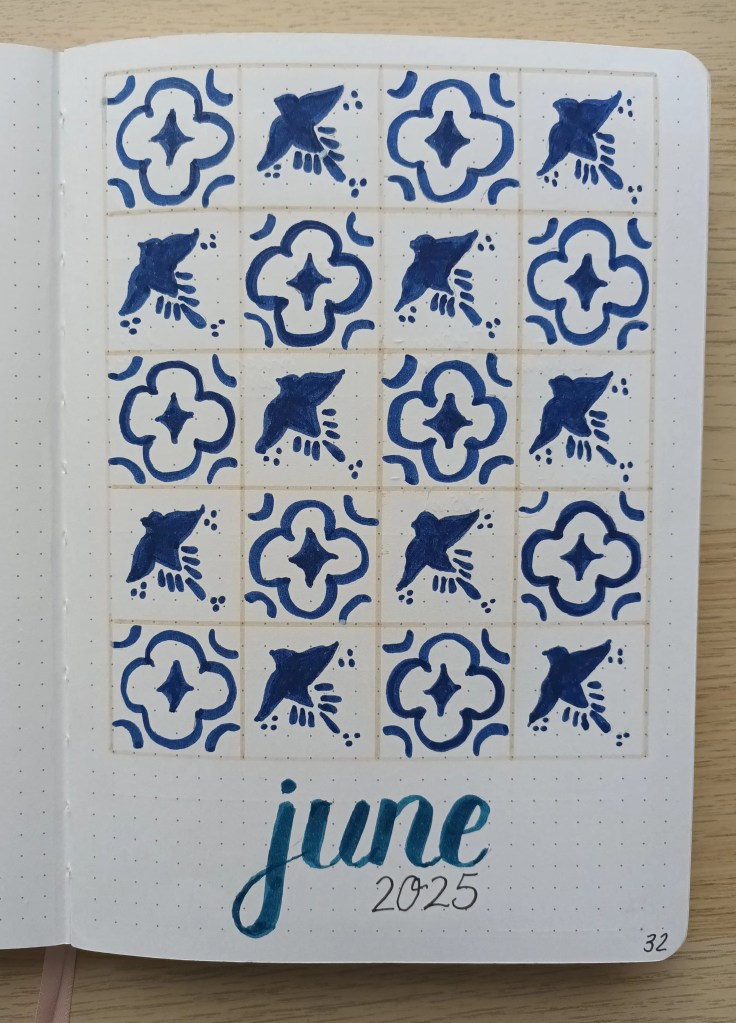
The Front Cover
I created my two tile designs on dotted paper from my Claire Fontaine pad and then traced them using pencil so I could create a repeating pattern and keep the images looking almost the same. They’re not exactly identical but this is in keeping with the hand-painted look which the traditional ceramic tiles would have. I then decide to outline the squares with a light sand colour Tombow. The June title was hand-lettered using my darkest blue Tombow and I went over it twice to intensify the colour. As I didn’t have a very dark blue Tombow, I had to make use of my Crayola Supertips which made it quite difficult to be precise with the colouring as the pens are quite thick and not super pointed. I think the tiles turned out okay but I’m not sure if the tile outline is impactful enough and I’ve been debating using a darker colour.
Monthly Calendar
I worked on a few more fairly simple tile designs for the spaces around my calendar, again using tracing paper to copy the images multiple times. I opted for a darker surround, but, as a dark yellow is quite often used in addition to the dark blue on azulegos, I thought it made them look more vibrant but still similar to the actual Portuguese tiles.

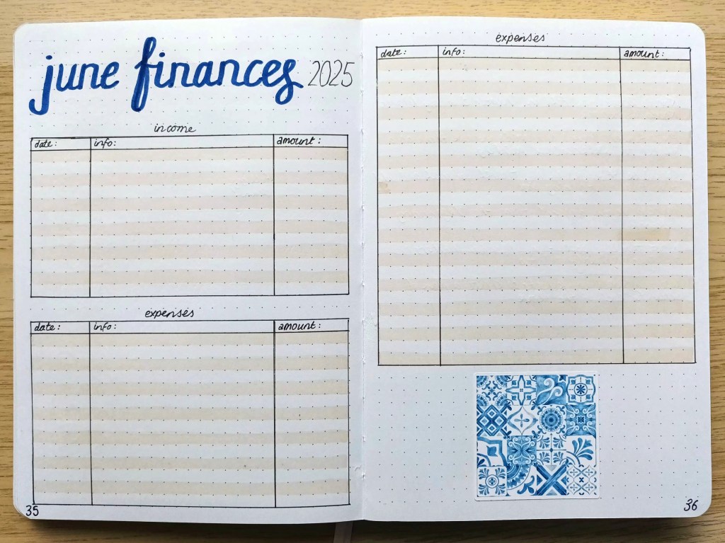
Finances – income and expenses
My usual financial information record with a Portuguese tile sticker I made using an image from Canva.
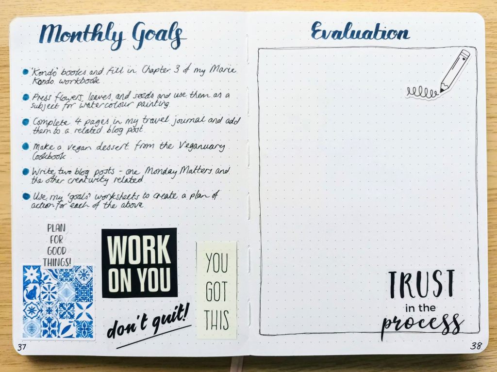
Monthly Goals
I’ve been setting monthly goals for a while now and like how they keep me focused on what I hope to achieve. I used both my vision board for 2025 and my seasonal bucket list to help me choose specific goals and I have some printables which I got from Etsy to help me map draw up action steps. I also use my monthly calendar and weekly spreads to record when I will work on each of the goals to ensure I meet with success.
I got some washi and PT tapes from The Washi Tape shop last month and decided to add a few motivational phrases on the pages. I love the different messages but I wish they were pre-cut like some of their other collections.
Final words…
I hope you enjoyed seeing my various spreads for this month. I don’t think I’ve ever done a theme with such a small range of colours before and I’m certain I’ve never used blue shades as the main focus of my palette at any time of year. I’m still not sure I’m happy with the front cover but I guess I’ll have to live with it as it’s done now! Let me know your thoughts or suggestions if you have any.
Wishing you a joyful June,

